Brand identity
Regal Group
A 39-page bilingual identity system for an international property developer — from the monogram to the façade sign.
Context
One mark, several sub-brands, two languages
Regal Group develops property internationally, with sub-brands — Regal Collection, Regal Legend, Regal Homes — that all had to sit under one parent mark without collapsing into each other.
The deliverable is a full brand book written in Vietnamese and English side by side, so the same rules travel between a Da Nang print vendor and an international agency without translation drift.
The mark
An arch, drawn as a signature
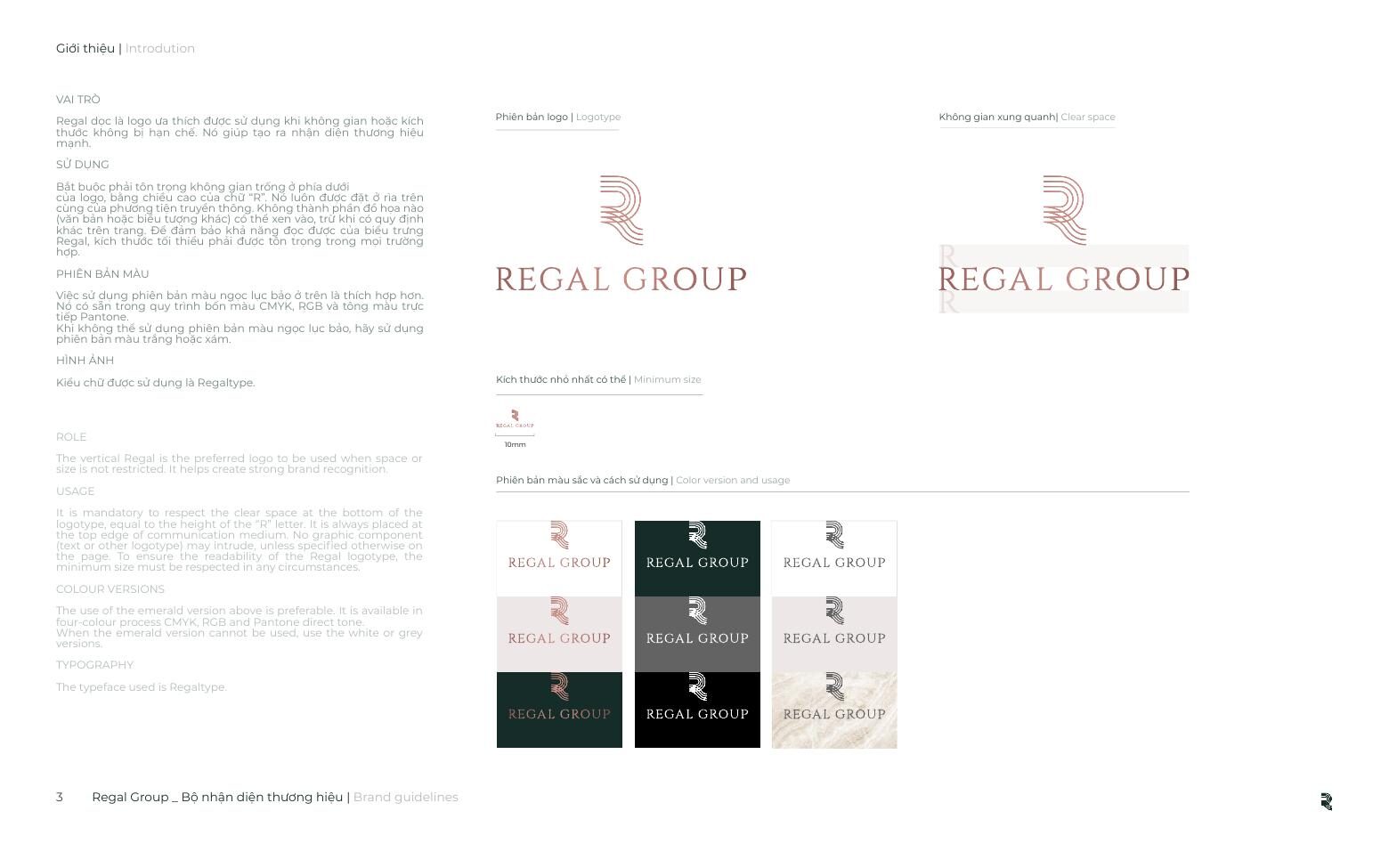
The “R” is built from concentric arcs — a colonnade seen in section, an arch, a single continuous stroke. It resolves three ways so it can survive any medium:
- Vertical logotype — preferred wherever space allows. Minimum 10 mm.
- Condensed horizontal lockup — for tight edges and banners. Minimum 15 mm.
- Monogram alone — quick recognition, embossing, favicons. Minimum 3 mm.
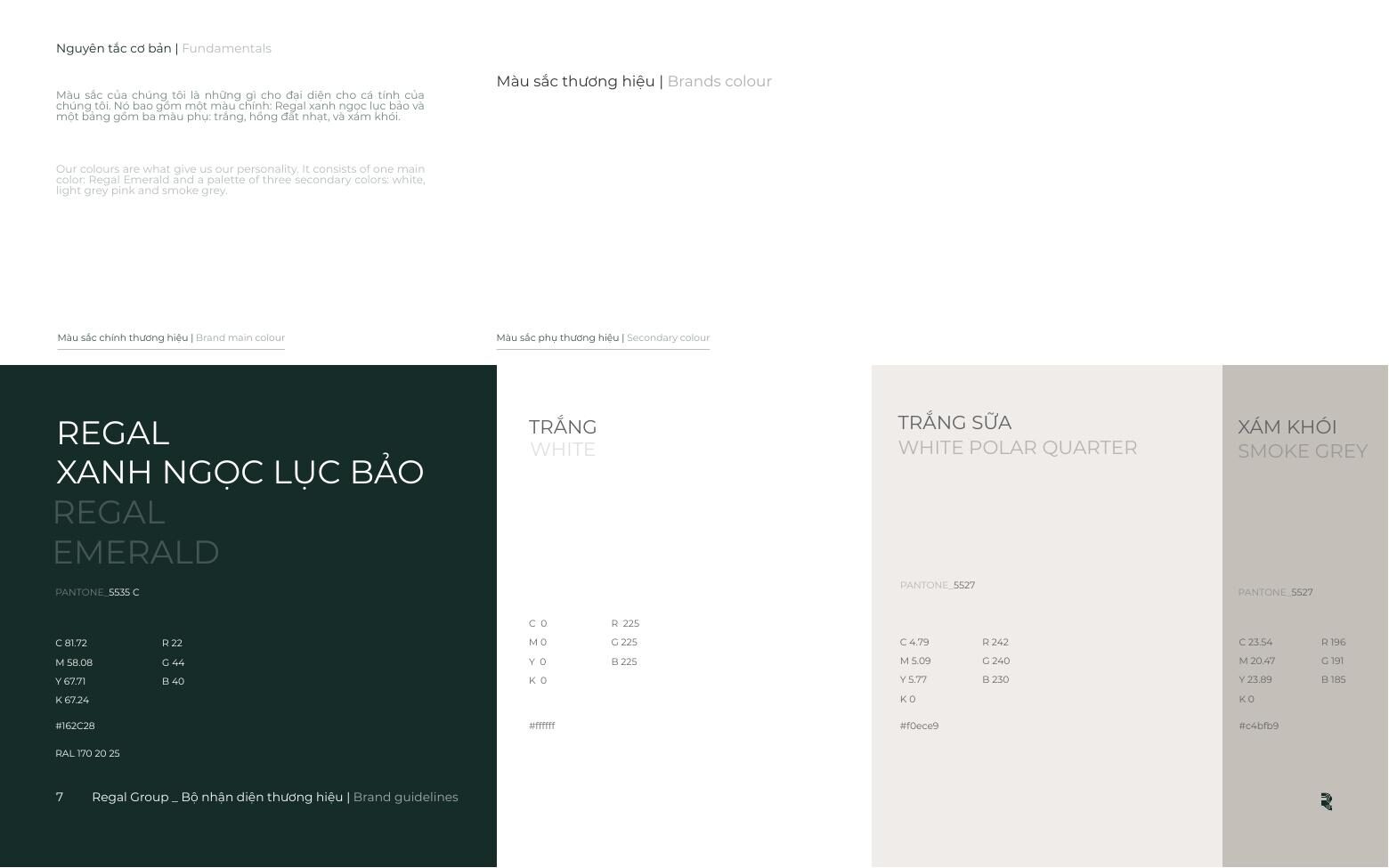
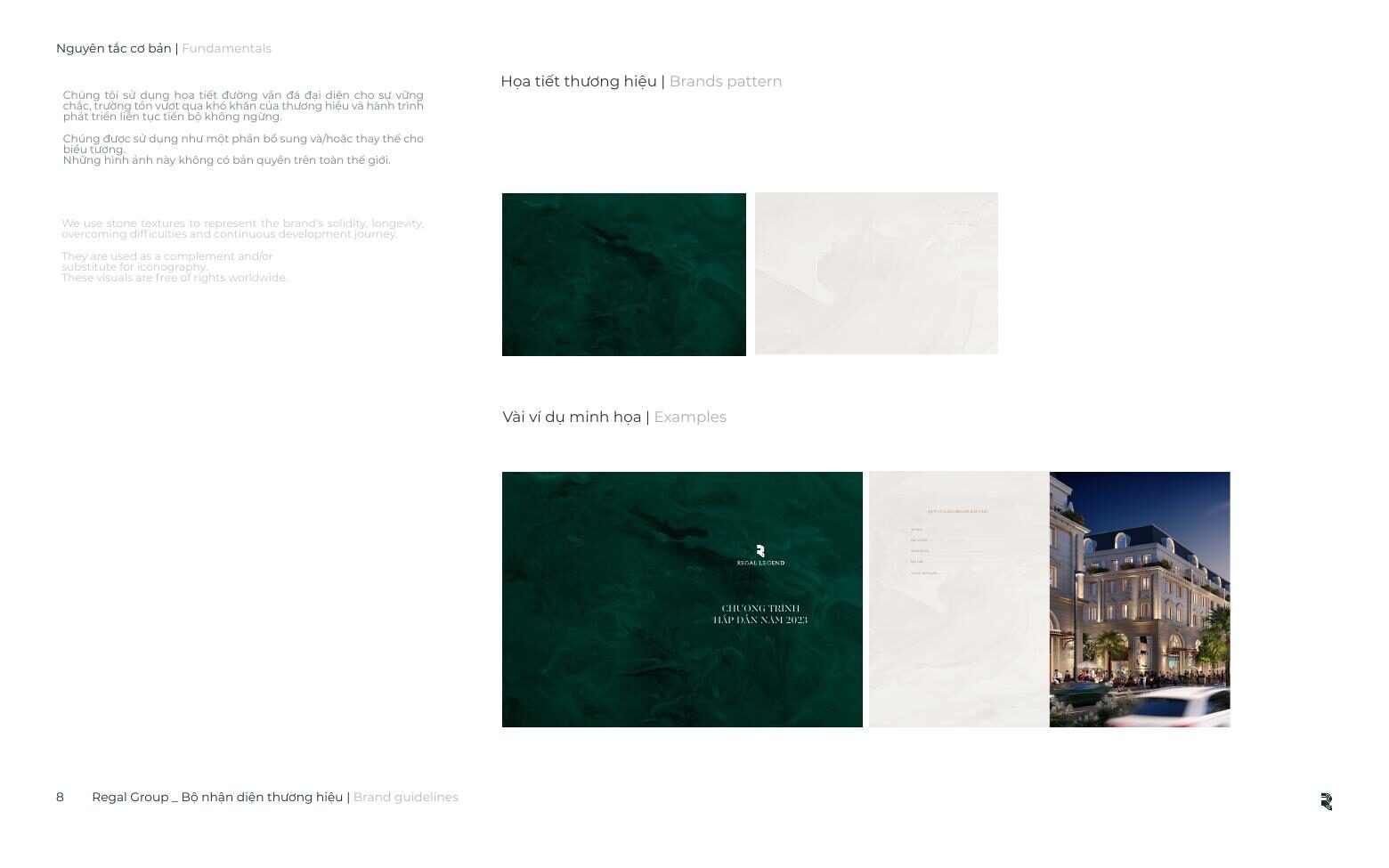
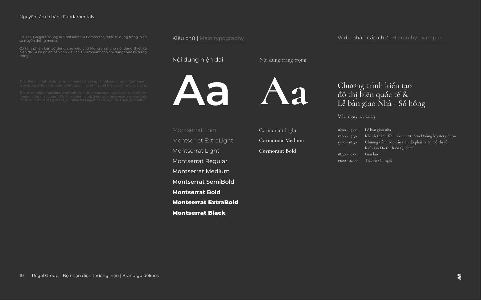
Emerald is the default and everything else is a fallback — the guideline says so explicitly, because “pick whichever” is how a palette dies. Typography pairs Cormorant for display with Montserrat for text. The brand pattern is marbled stone: solidity, longevity, a journey that keeps going.
What made it hard
Rules that survive contact with reality
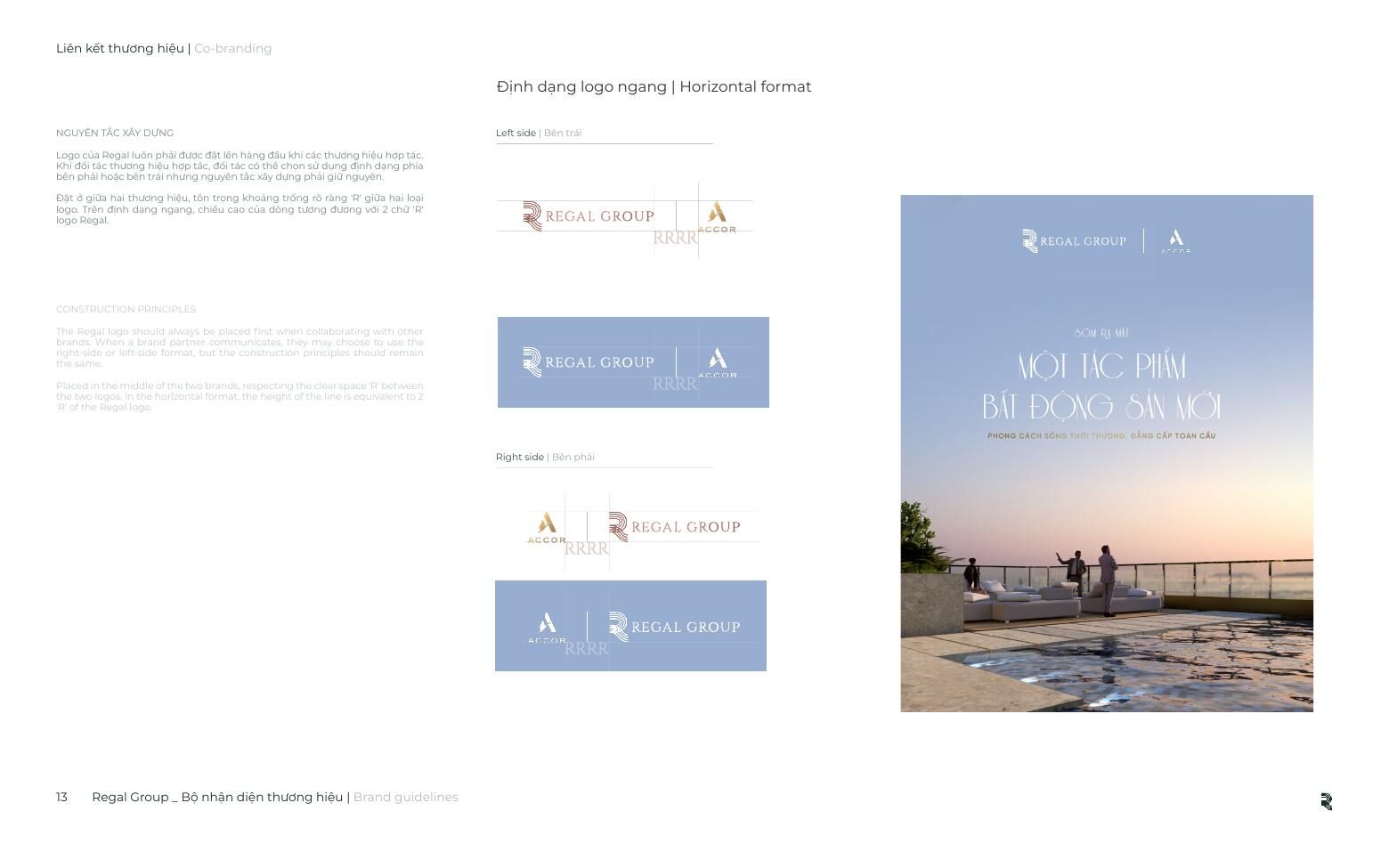
A sign fabricator, a print vendor and an in-house marketer all open the same document and need different things from it. So every page pairs the principle with the measurement: clear space in “R” widths, minimum sizes in millimetres, and a Don’t use column showing the specific ways the lockup actually gets broken in the wild.
Application
From a business card to a building
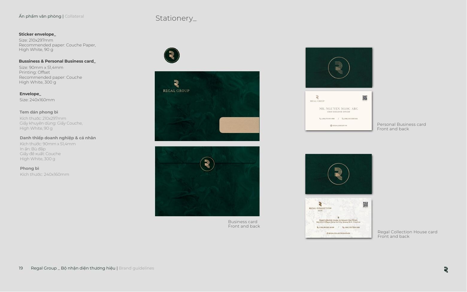
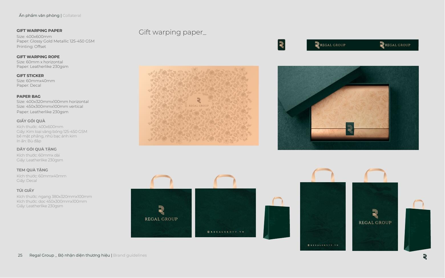
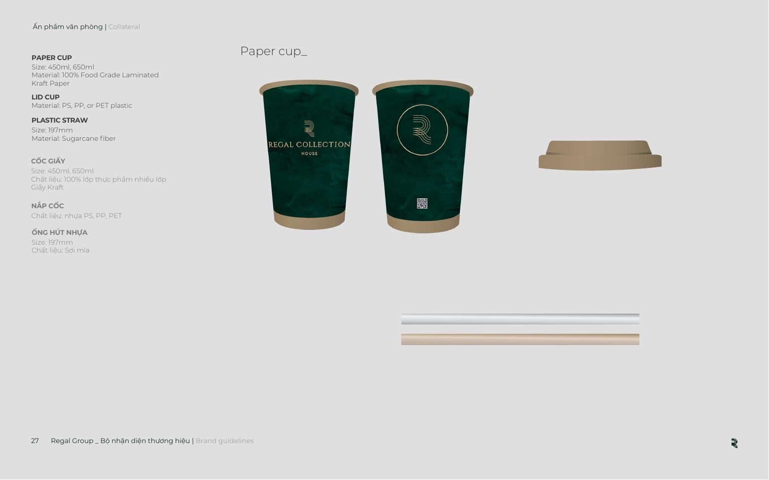
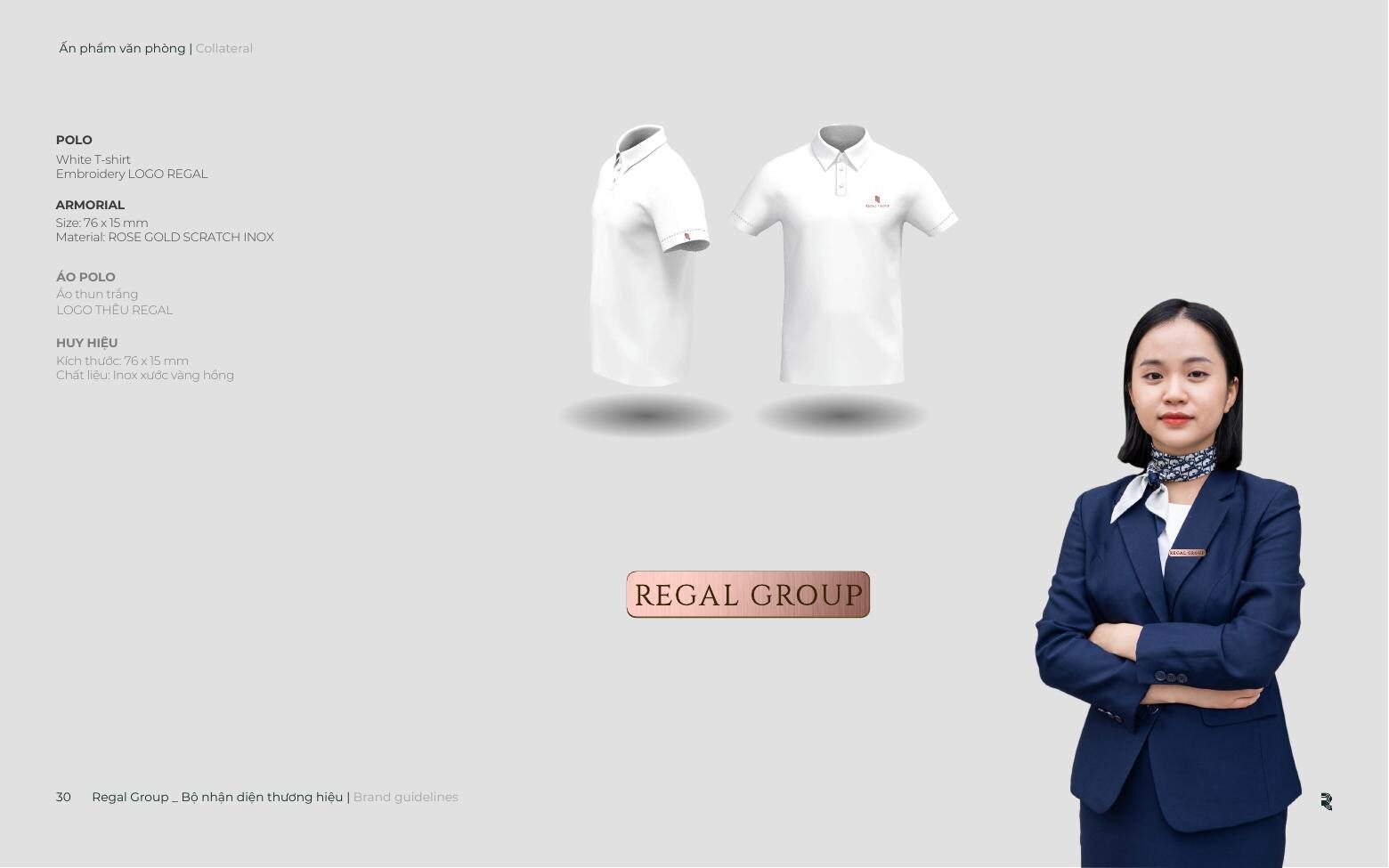
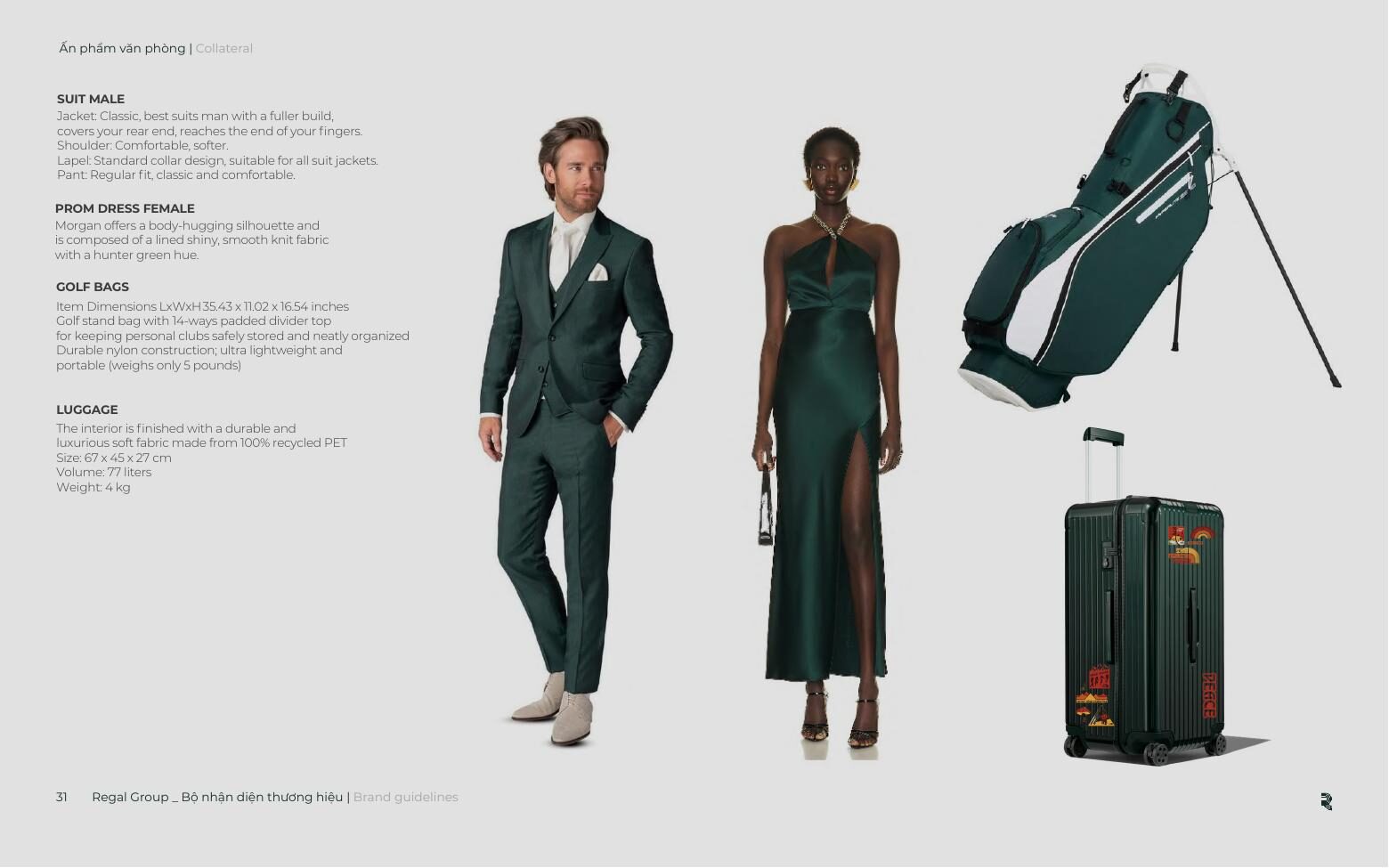
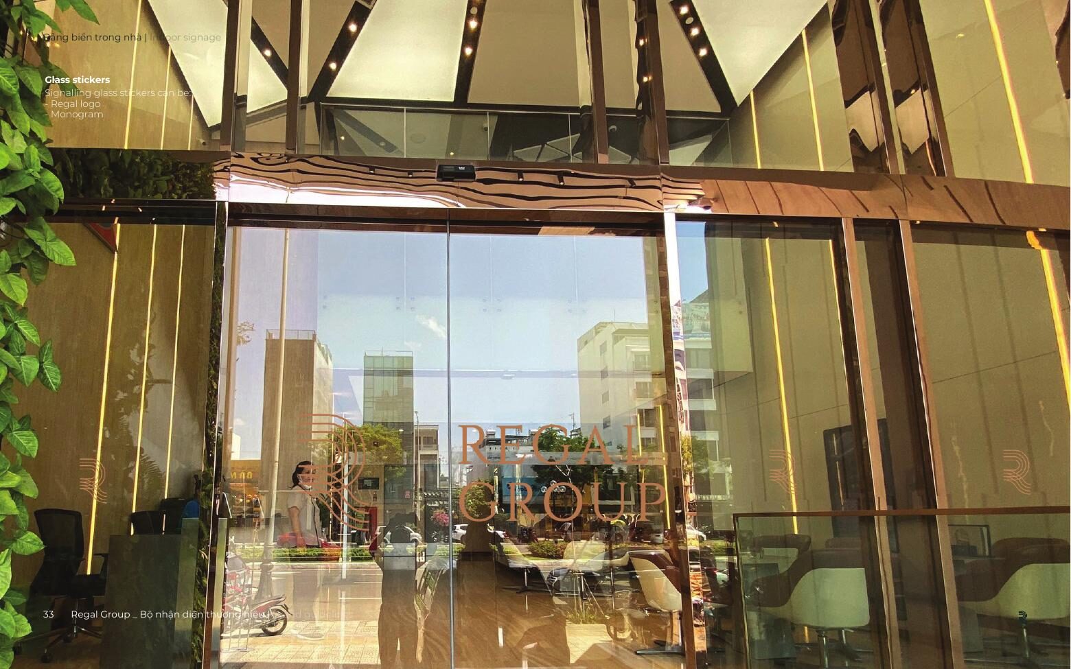
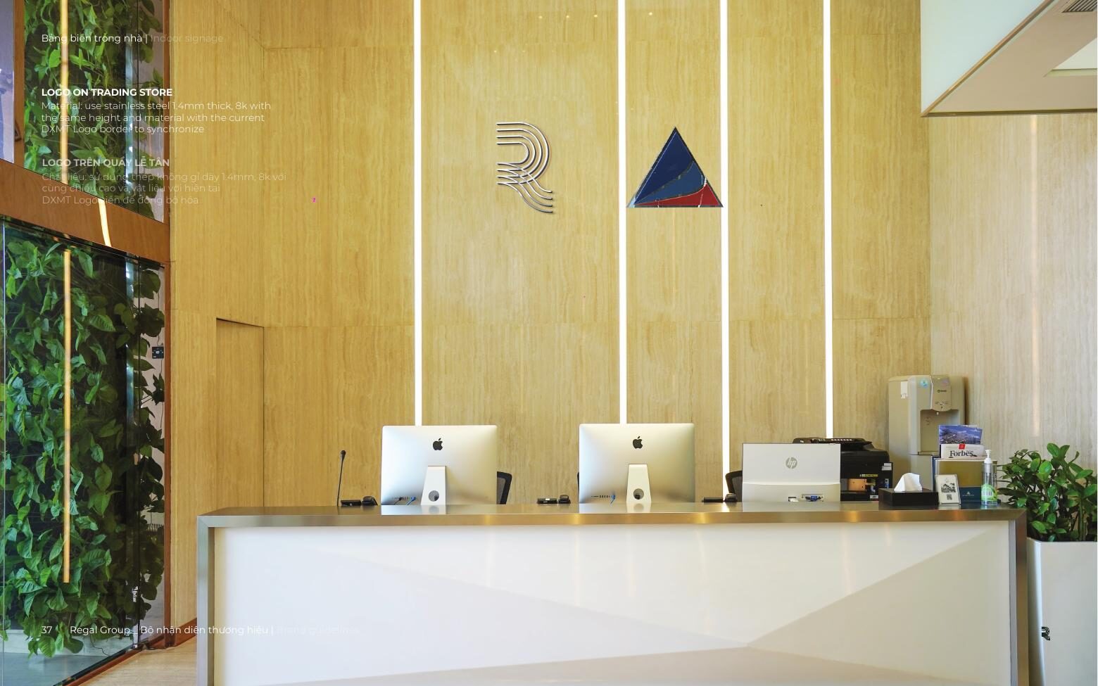
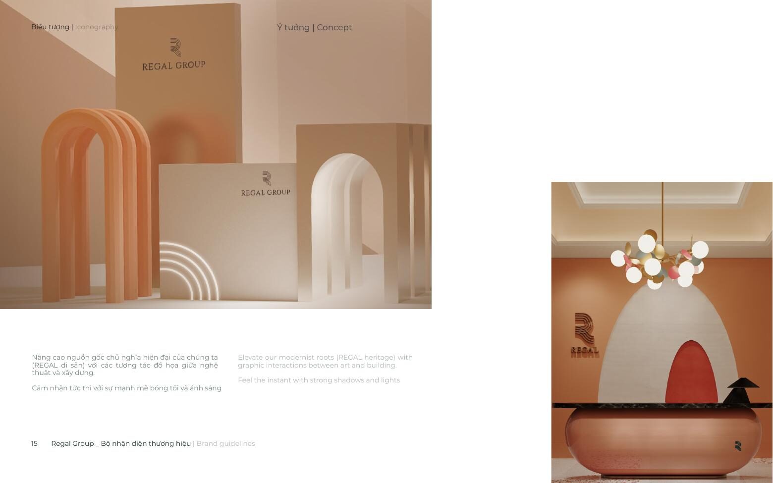
Roughly two-thirds of the book is application: stationery, proposal decks, packaging and gift wrap, paper cups, uniforms, lanyards, luggage and golf bags, façade signage, reception walls, glass stickers and room numbering.