Brand identity
Gleam
Coffee & Tea
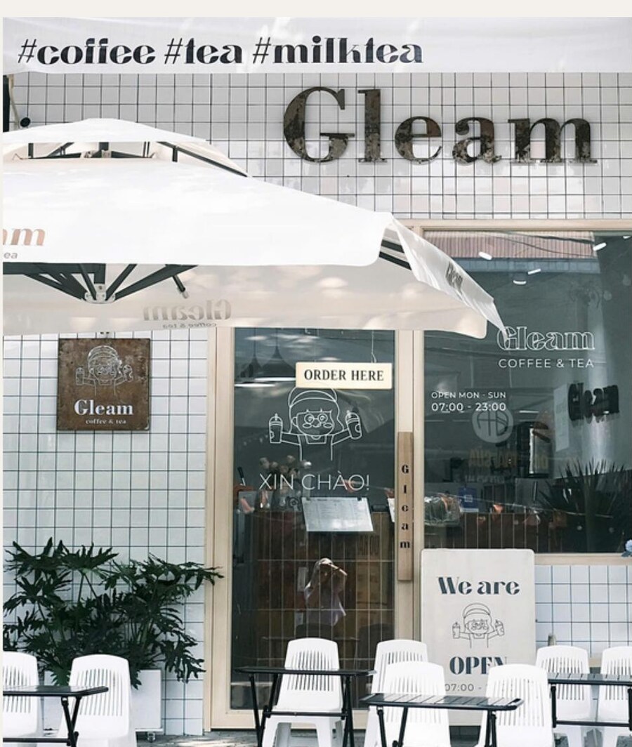
A logo, a line-drawn mascot and a shopfront — an identity built to be read from across the street.
Context
A small shop on a busy street
Gleam is a coffee and milk-tea shop on Nguyen Trai in Da Nang. It competes with a dozen others on the same road, most of them fighting with the same tools: bright photos of drinks and a discount sticker.
The brief was a full identity — logo, colours, cups, signage — with one practical constraint underneath: it has to work at 3 cm on a cup lid and at two metres on a wall, in daylight, from a moving scooter.
The mark
A face, drawn in one weight of line
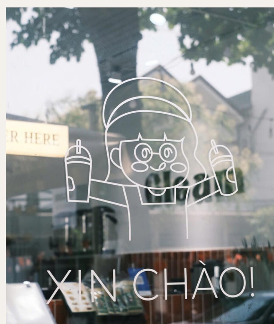
The wordmark is a warm slab-ish serif — friendly, a bit retro, distinct from the geometric sans every other shop was using. Beside it sits a mascot: a character in a cap holding two cups, drawn in a single uniform line weight.
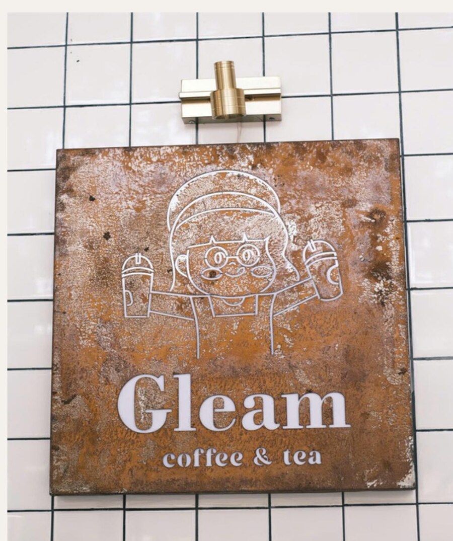
That single weight is what makes the identity portable. The same drawing survives being etched into rusted steel, cut as vinyl on glass, and printed one-colour on a cup — because there are no fills, no gradients and no thin strokes to lose.
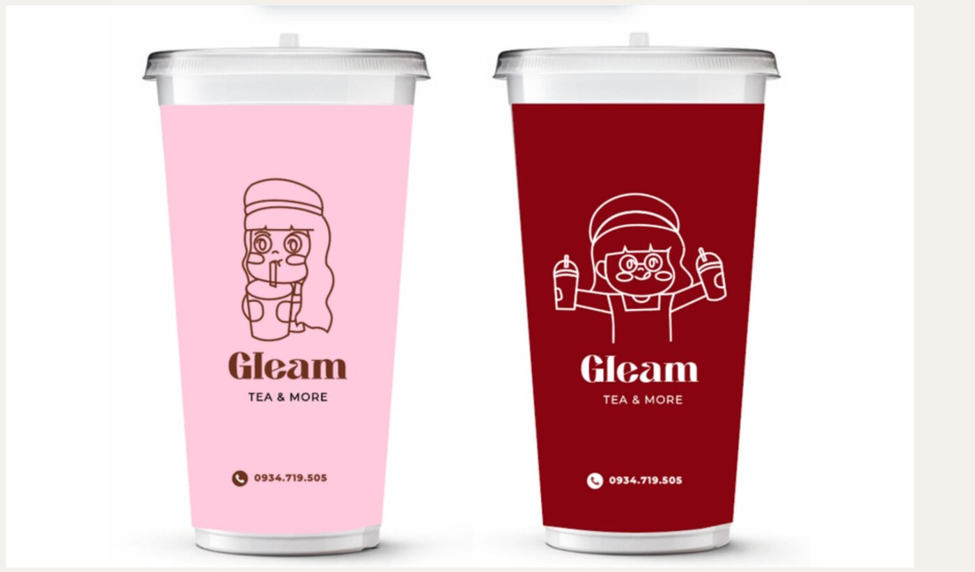
Two cups, two moods. Soft pink for tea and milk tea, deep red for coffee — so staff and customers can tell an order apart at a glance, without reading anything.
The mascot changes pose between the two. Same line, same weight; a small reward for anyone who notices.
Application
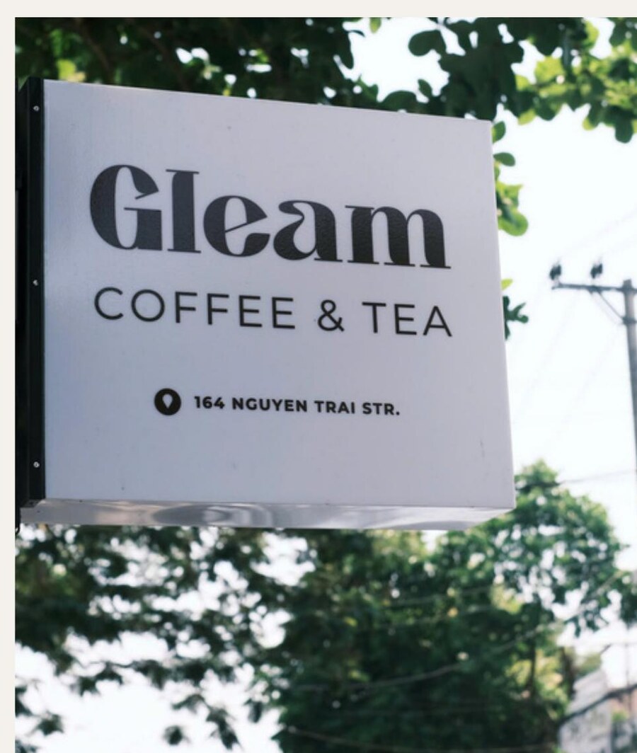
Four surfaces, four treatments
Each placement got the version of the mark that its material could actually hold — rather than the same file scaled up and down.
What I took from it
Design for the fabricator you have
The shop was built by local sign makers working from printed sheets, not a shared file system. Anything that needed exact colour matching or fine detail would have drifted.
So the identity was drawn to survive that: heavy line, high contrast, no gradients, and a wordmark that still reads when it is cut slightly wrong. It is built, it is open, and it looks like the file.