Graphic design
Print & Packaging
Work that has to survive a printer — cartons, dielines, labels, posters and stationery.
Screen design forgives. Print does not — a dieline that is 2 mm out becomes a thousand boxes that will not fold. This is the work where I learned to design backwards from production.
01 — Packaging
SAME — clinical skincare
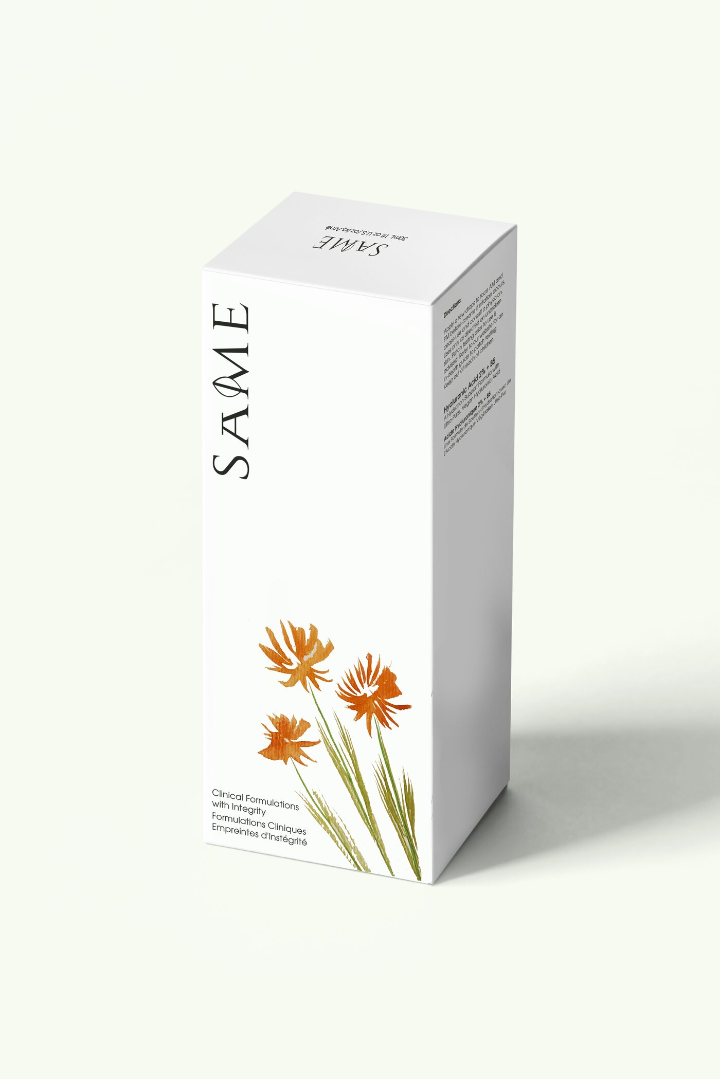
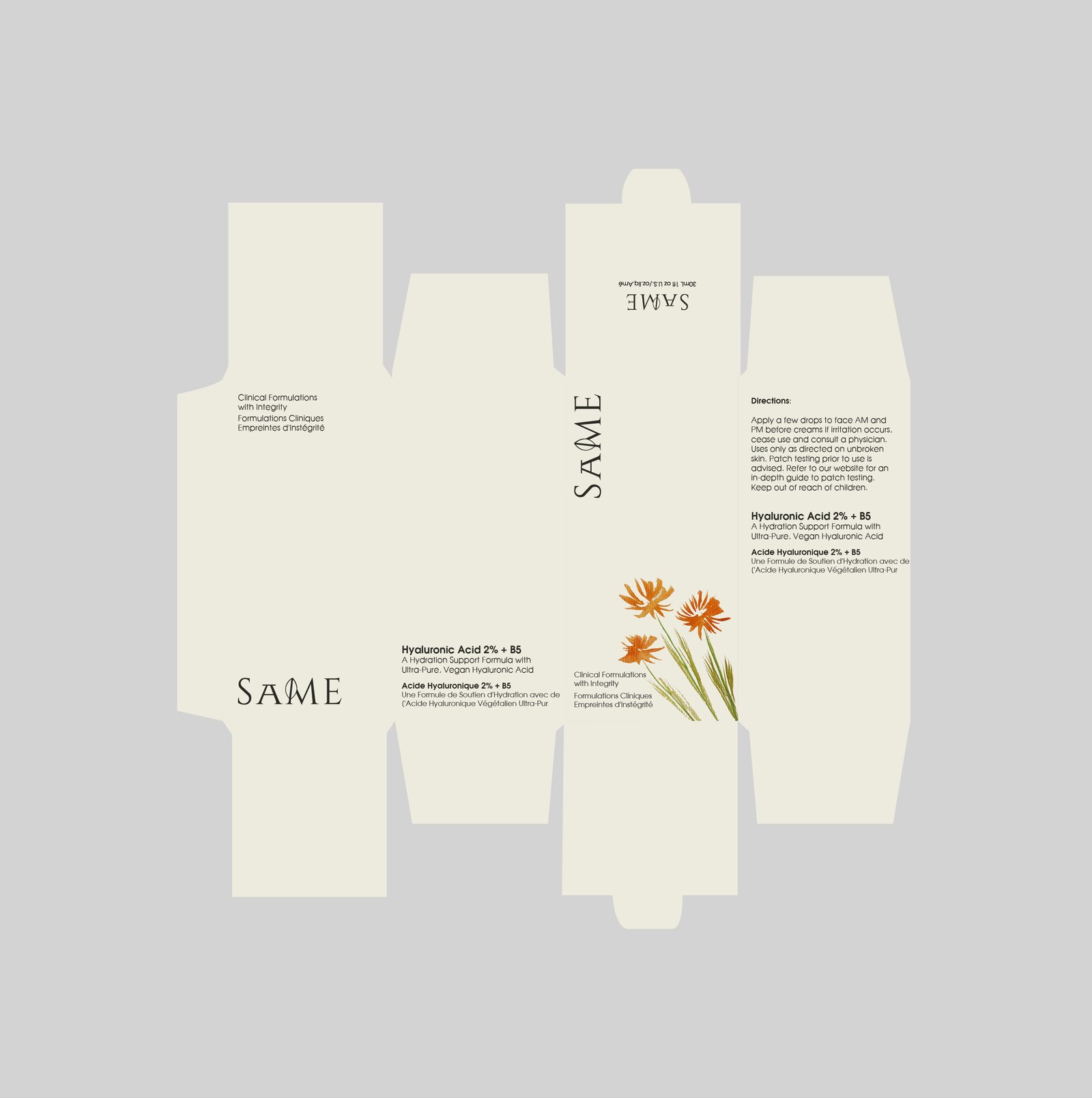
A carton for a hyaluronic acid serum, in English and French on the same panel. Uncoated cream stock, a high-contrast serif logotype, and a botanical illustration sitting low so it never fights the ingredient claim. Delivered with the production dieline, not just the render.
02 — Packaging
tazan — scented candles
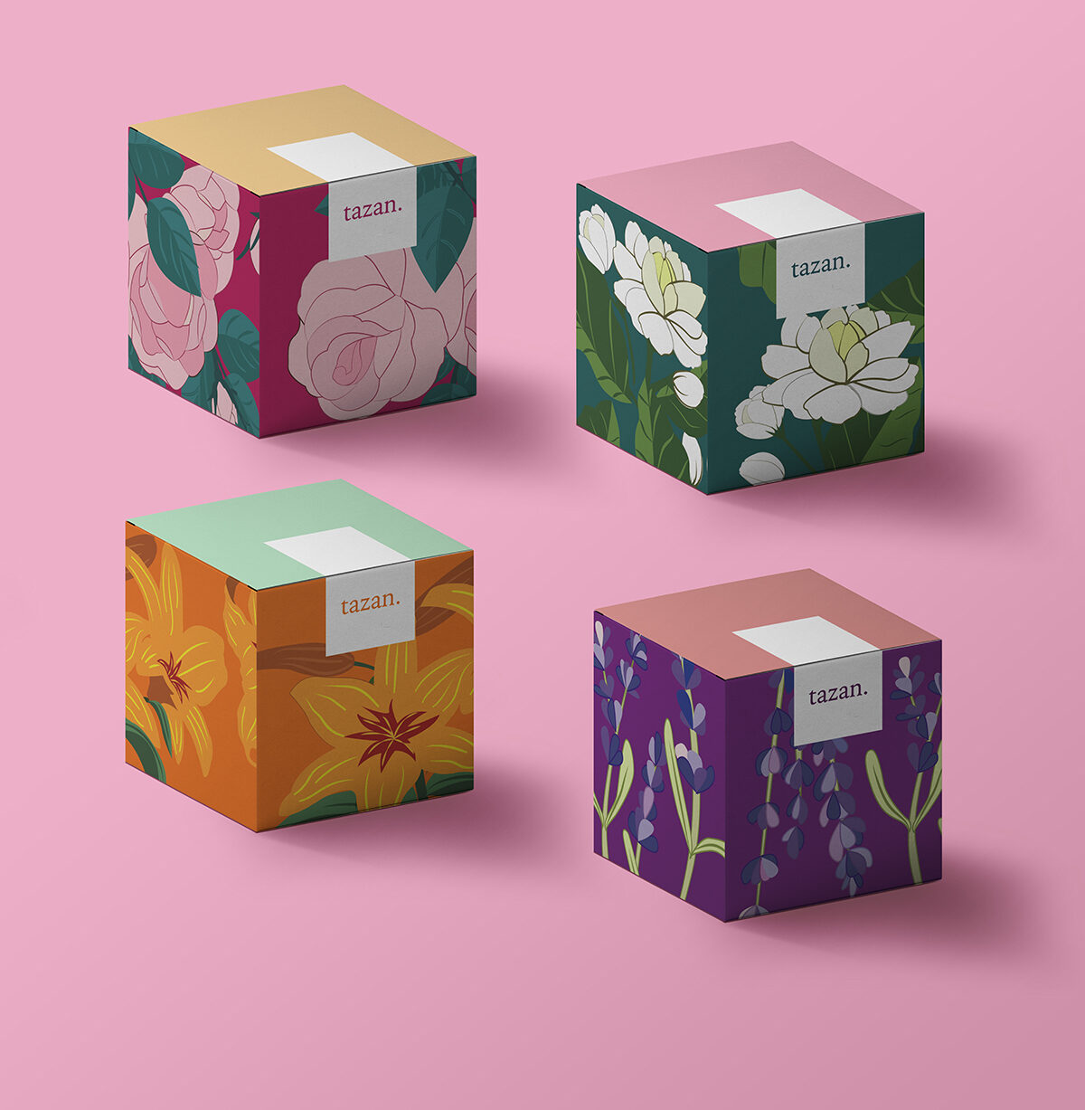
Four SKUs — Jasmine, Rose, Lavender, Lily — each a full-bleed botanical illustration wrapping the box, with a colour-blocked lid that lets the range read as a set on shelf. The circular label series carries hand-lettered scent names so each variant has its own voice inside one family.
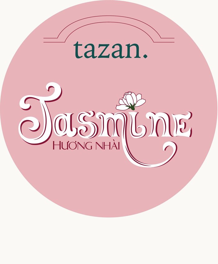
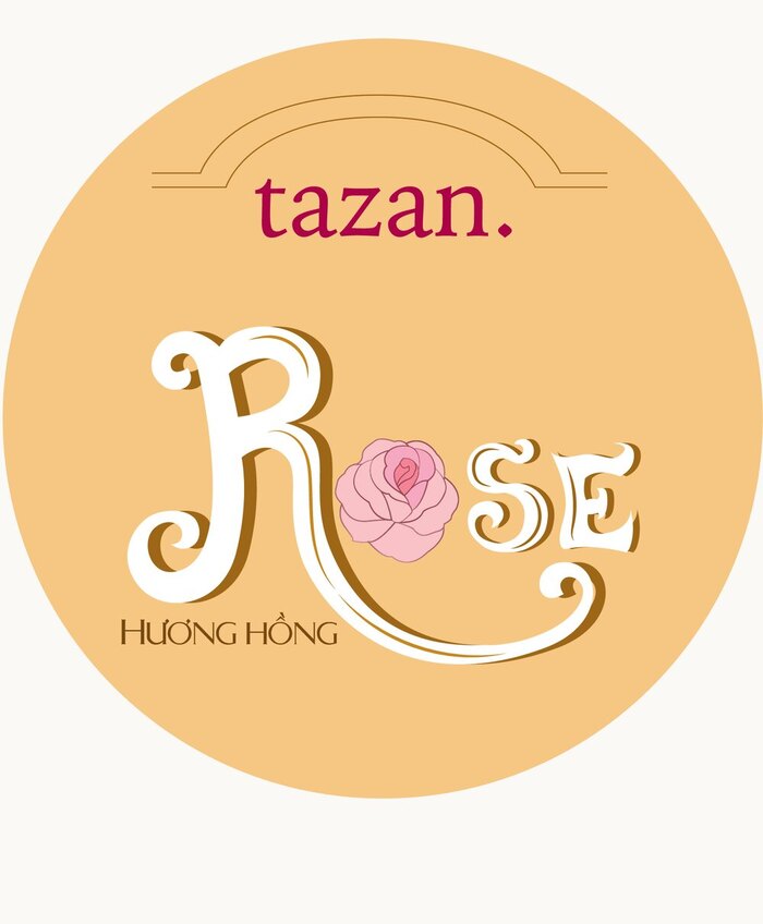
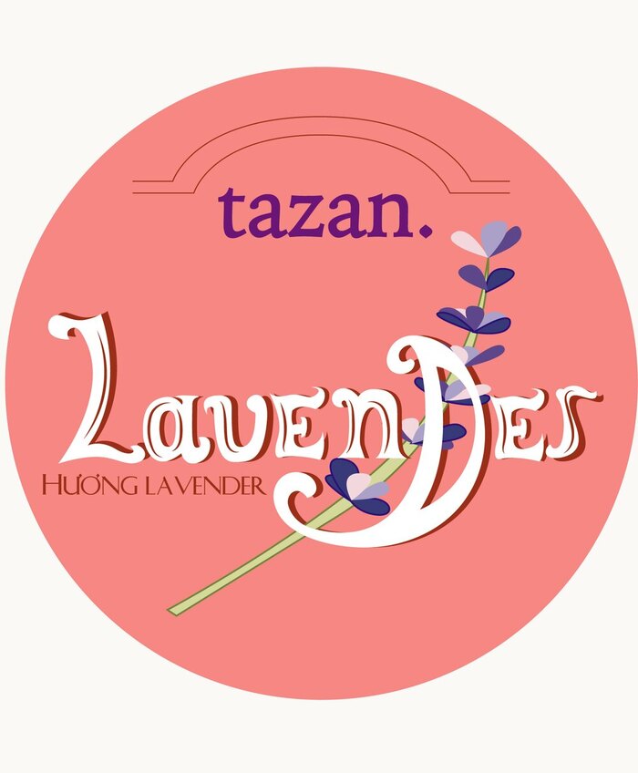
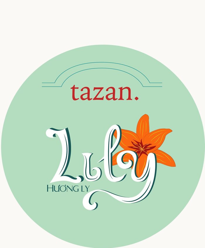
Hand-lettered scent names — Jasmine, Rose, Lavender, Lily — each drawn to sit inside the same circular frame.
03 — Poster
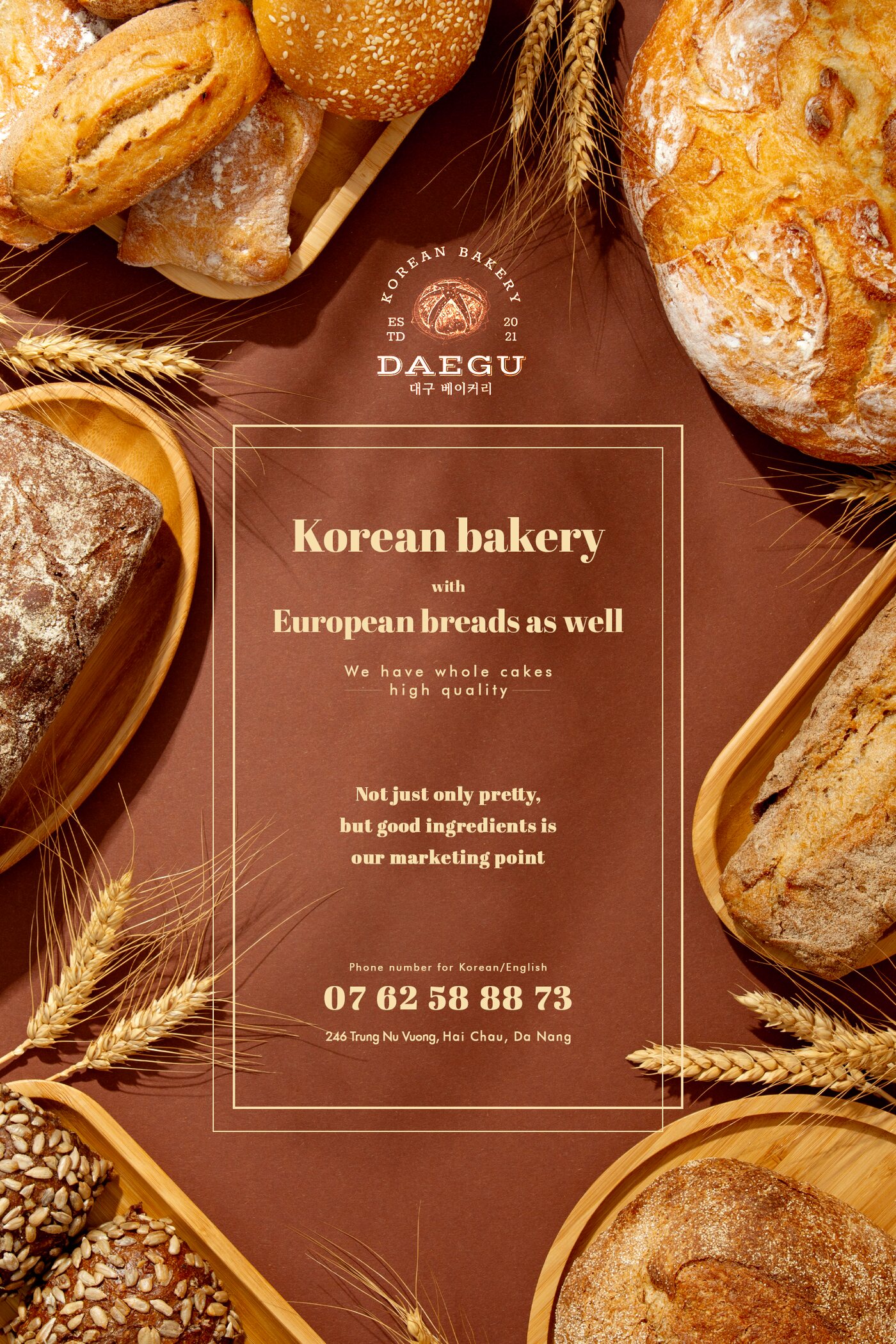
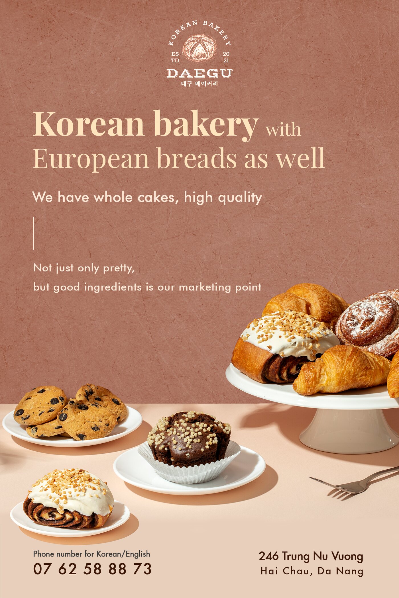
Daegu — two routes, one brief
A Korean bakery in Da Nang, bilingual copy, one message: Korean bakery with European breads. I took it two ways — a framed, typographic route on a flat brown field, and a photographic route with the product cascading down the page. Same words, two entirely different reads.
04 — Identity & insert
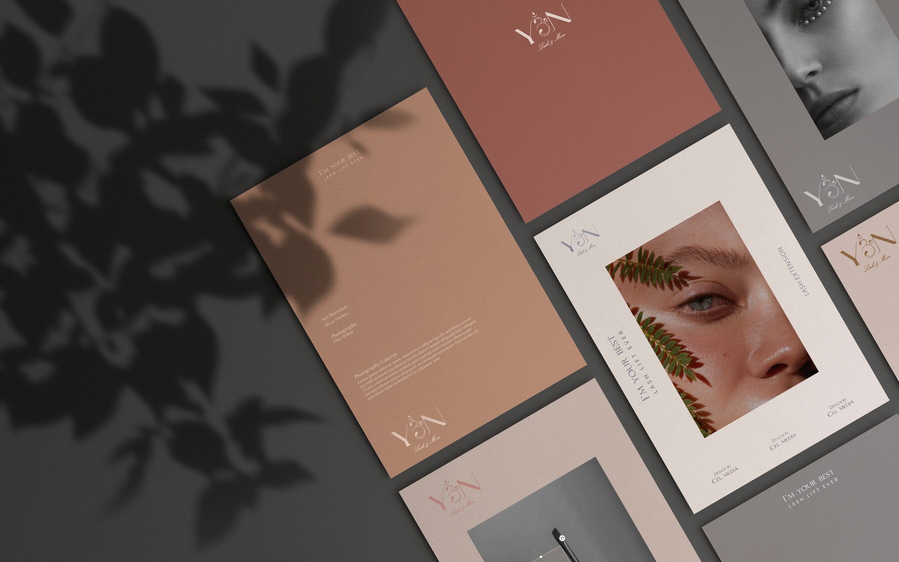
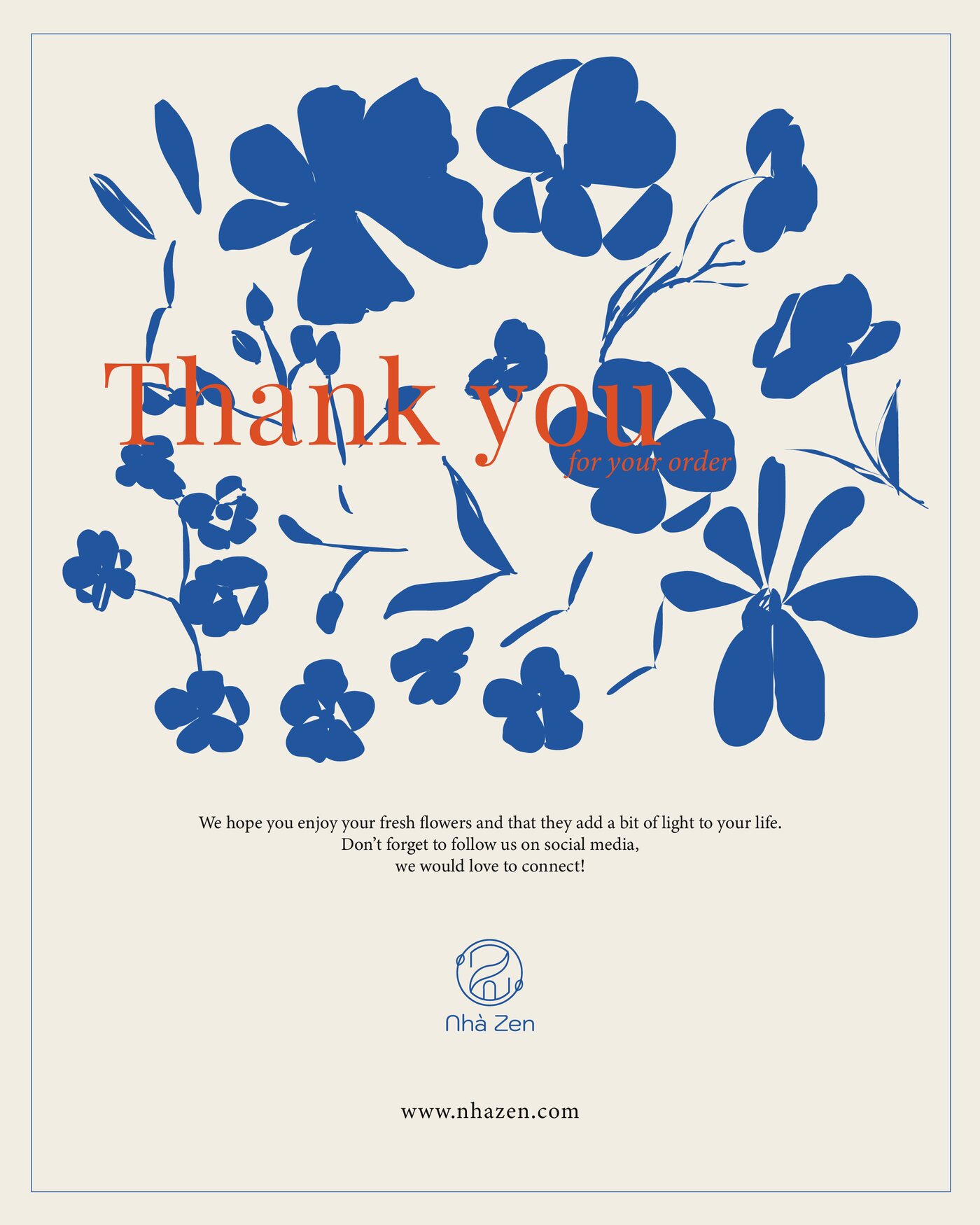
YÊN and Nhà Zen
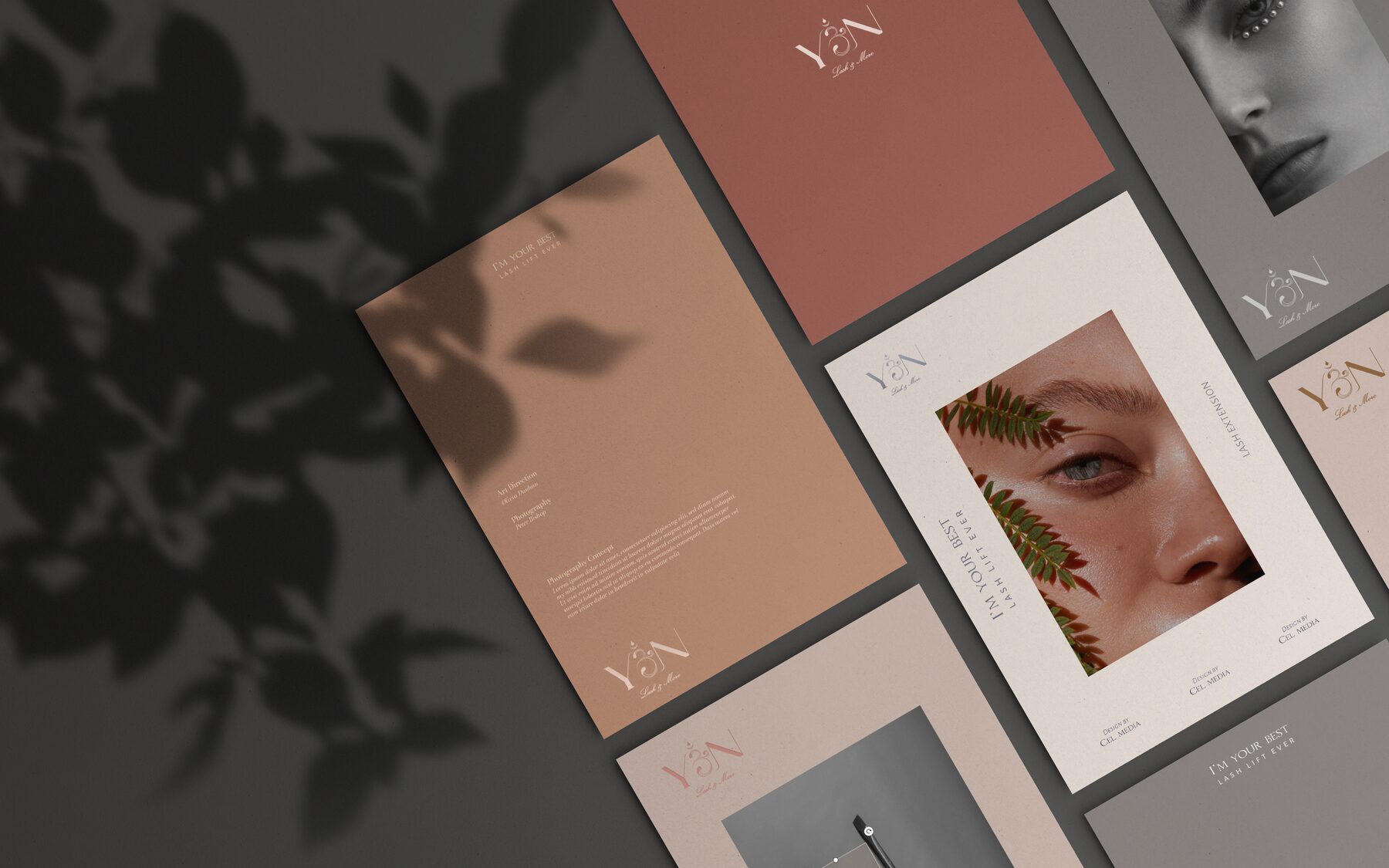
A stationery suite for YÊN in terracotta, clay and grey, built around a ligature monogram and editorial layouts. For Nhà Zen, a thank-you insert that ships inside every flower order — cobalt cut-paper florals under a terracotta serif, warm enough to keep.
05 — Campaign
Regal Legend — events
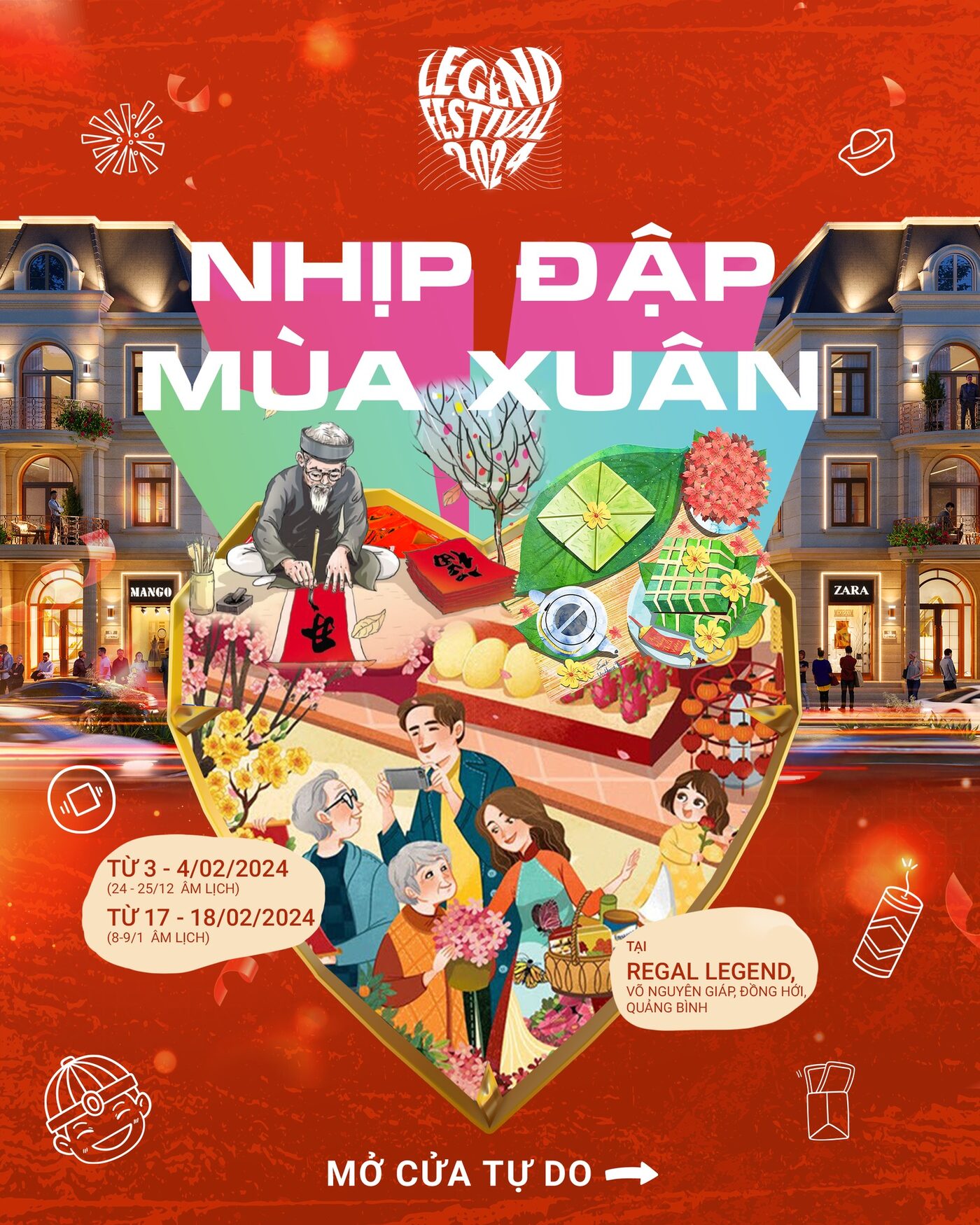
Campaign artwork for a property developer’s event programme: a concert key visual for Mỹ Linh and Bùi Lan Hương, and a Tết festival poster built around an illustrated tray of new-year rituals. Both had to carry a luxury property brand and still feel like an invitation.