Social · Art direction
Dreamlife
A feed system for an architectural rendering studio — rules that keep twelve posts looking like one thing.
Context
When the product is the image
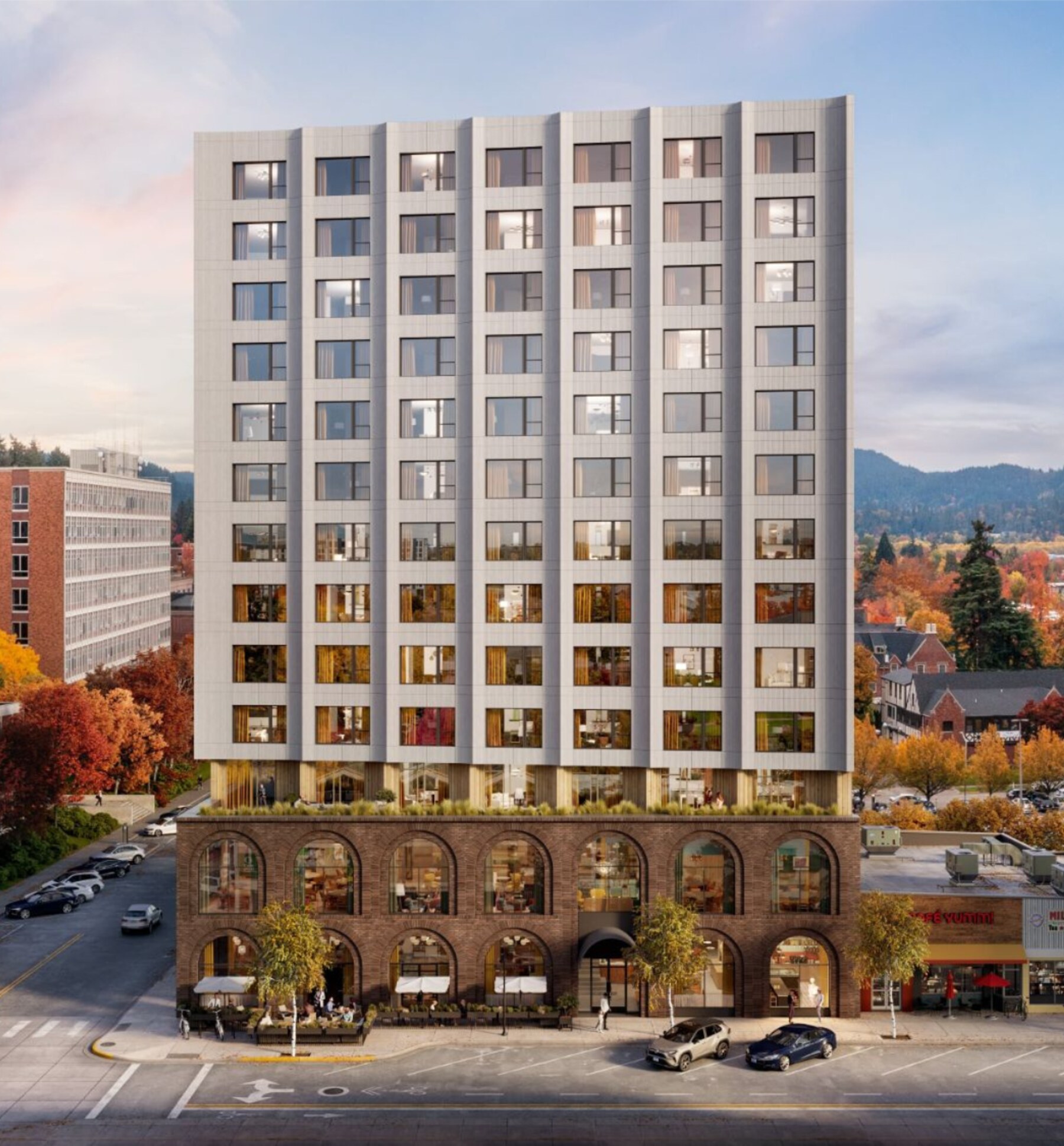
Dreamlife sells 3D renderings, animation and virtual tours to property developers. Their Instagram is not marketing about the work — it is the work. Every post is a portfolio piece.
Which creates a specific problem: when every image is beautiful on its own, the grid turns into noise. Twelve gorgeous renders in twelve different colour temperatures read as twelve different companies.
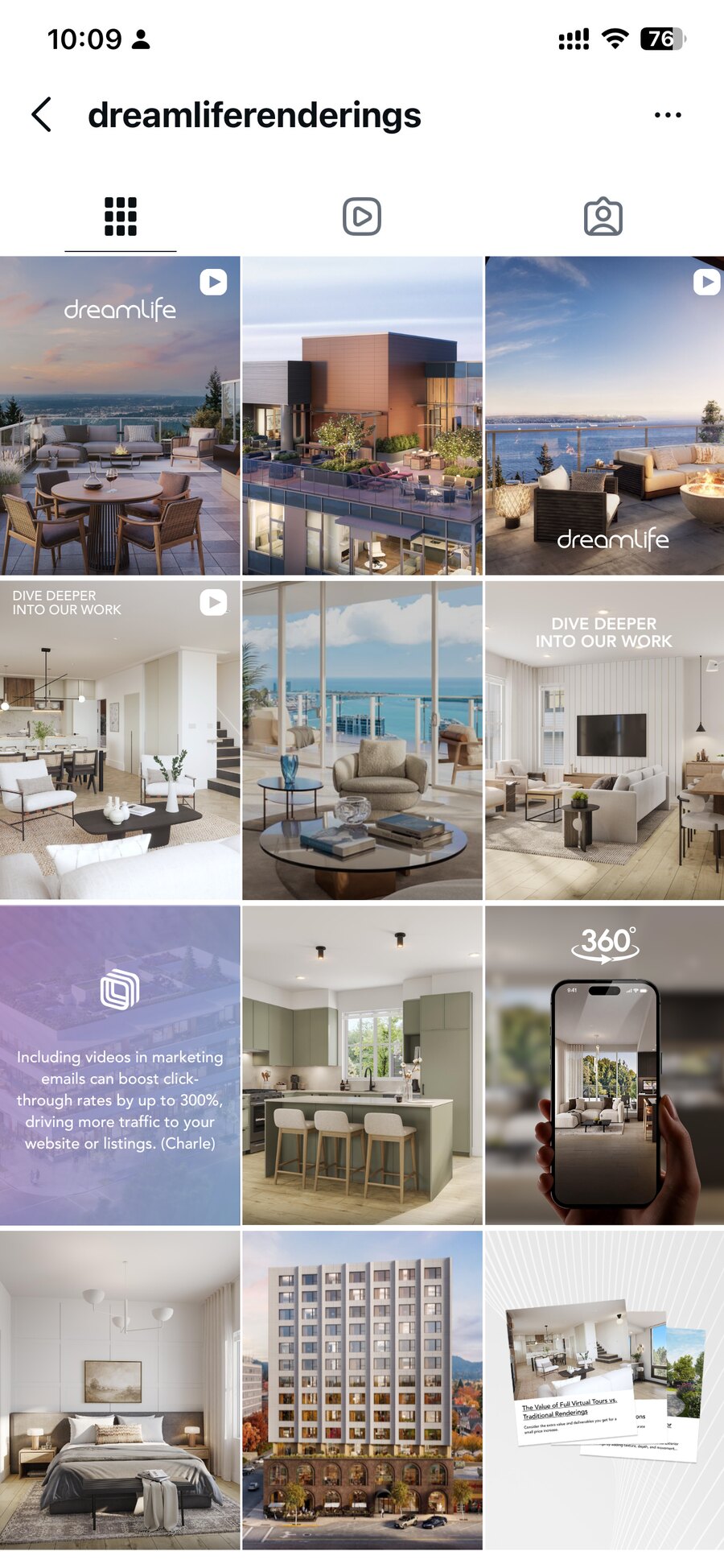
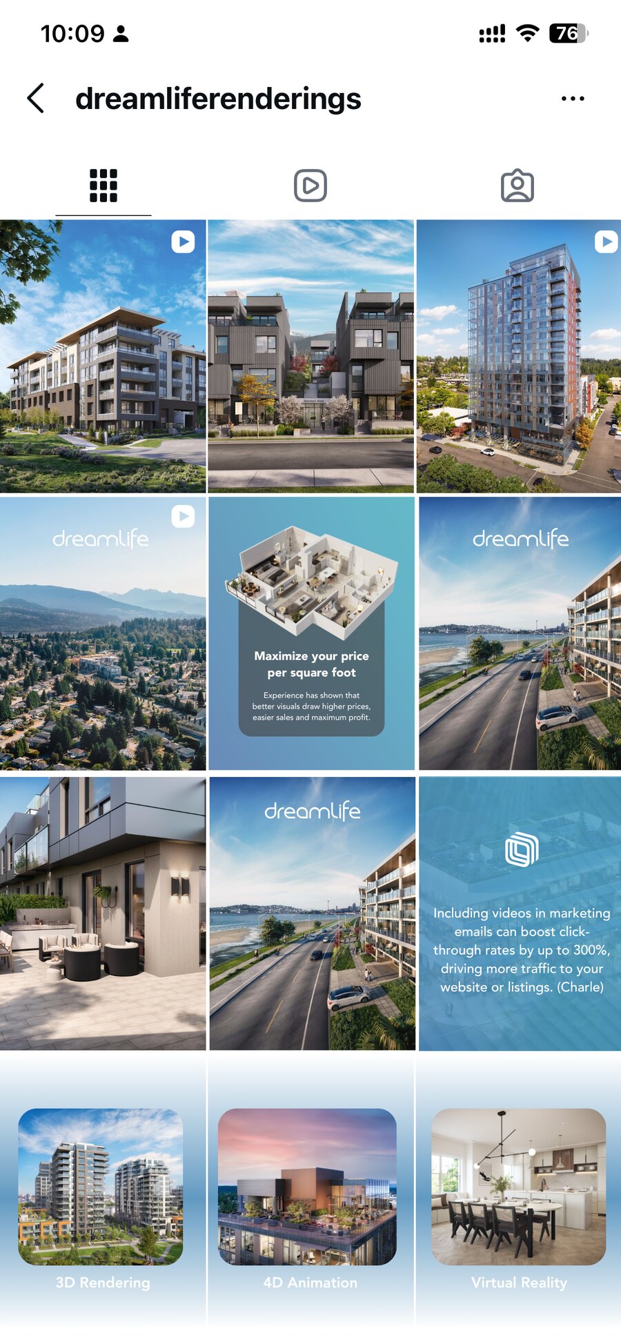
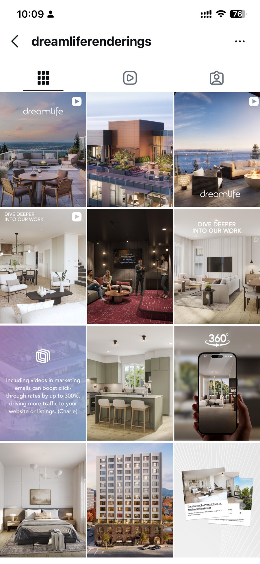
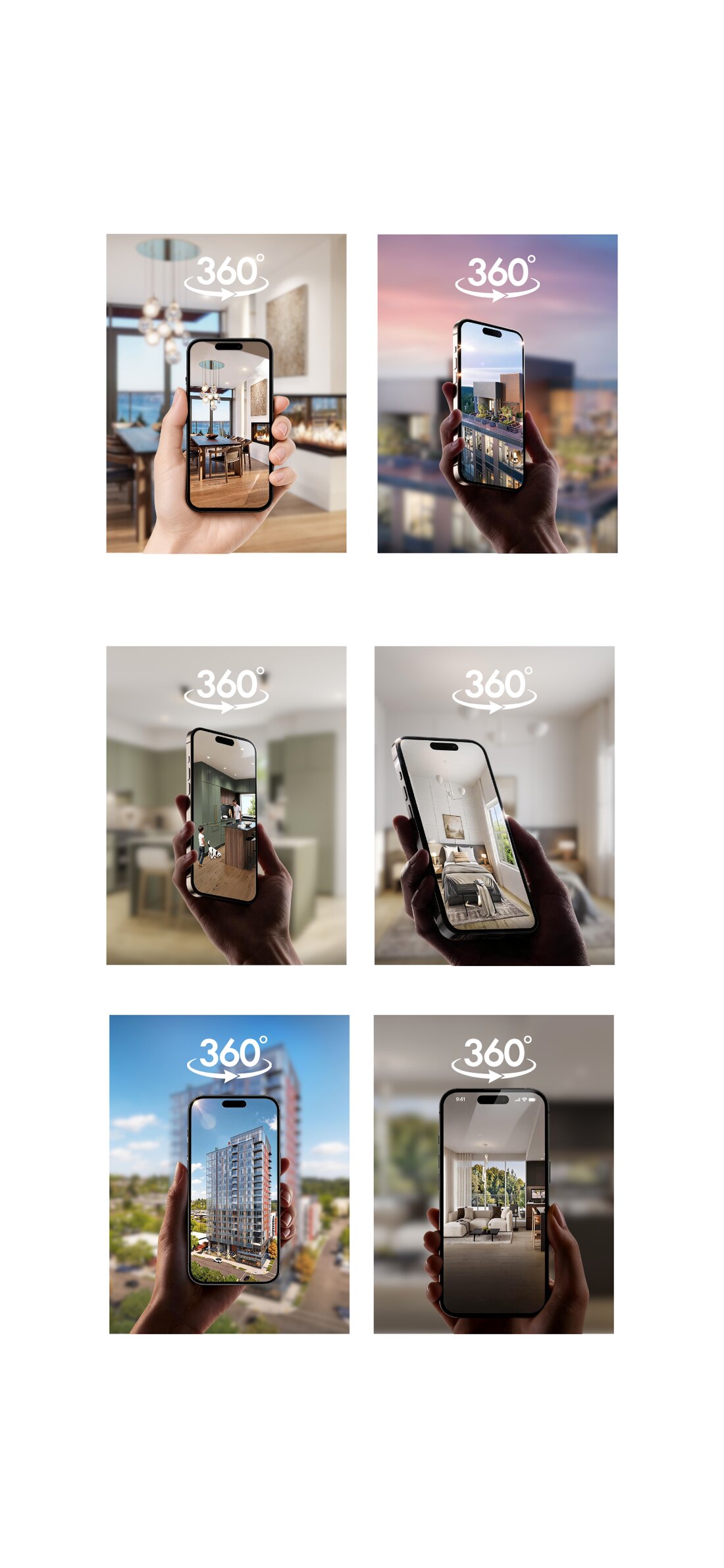
The unit of design is the grid, not the post. Each of these was composed as a twelve-tile block before any single image was scheduled.
The system
Four rules, written down
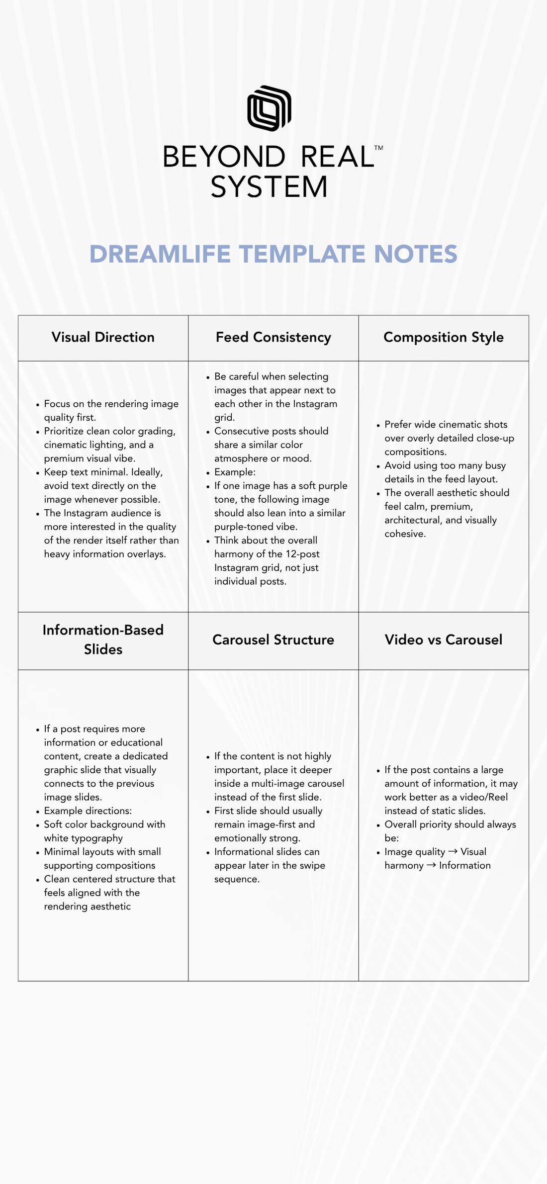
- Image quality first. Render quality, clean colour grading, cinematic light. Text stays off the image wherever it can.
- Neighbours must agree. Posts are chosen by what sits next to them in the grid. A soft purple render is followed by another in the same temperature — the harmony is horizontal, not chronological.
- Wide over tight. Cinematic wide shots beat detail close-ups in a feed; busy detail becomes mush at thumbnail size.
- Information slides come later. If a post needs explaining, the first slide is still the image; the diagram goes second. Image quality → visual harmony → information, in that order.
Why it was written, not just designed
The client posts it, not me
A set of pretty templates lasts about three weeks. What lasts is a document that tells whoever is scheduling this month which of two good images to use — and why.
So the deliverable was both: the templates, and a plain-language note explaining the reasoning behind each rule. Someone who has never met me can keep the feed coherent from it.