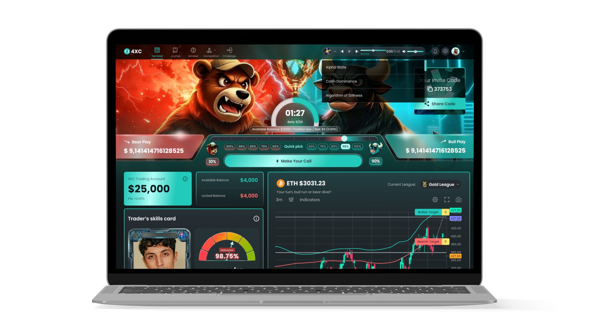
Illustration · Motion
Illustration
& Motion
Explainer systems for clients selling something you cannot photograph.
Cybersecurity, data infrastructure, credit-risk software — none of it can be photographed. Illustration is how these companies show what they do, which makes the drawing style a strategic decision, not a decorative one.
01 — Illustration system
CYSPA — threat without fear
A twelve-frame illustration system for a German cybersecurity partner. The constraint was tone: security marketing slides very easily into hooded-figure horror, which paralyses buyers instead of moving them.
So the system uses a flat, friendly vector language and a tight palette — corporate blue for infrastructure, yellow for the human moment, red used sparingly and only for actual threat. The skull appears once. The rest of the story is about capability.


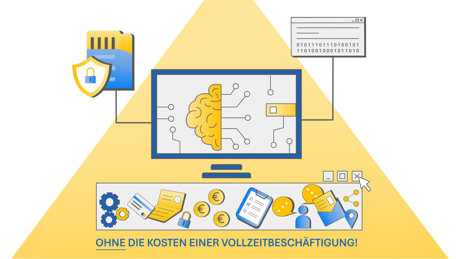

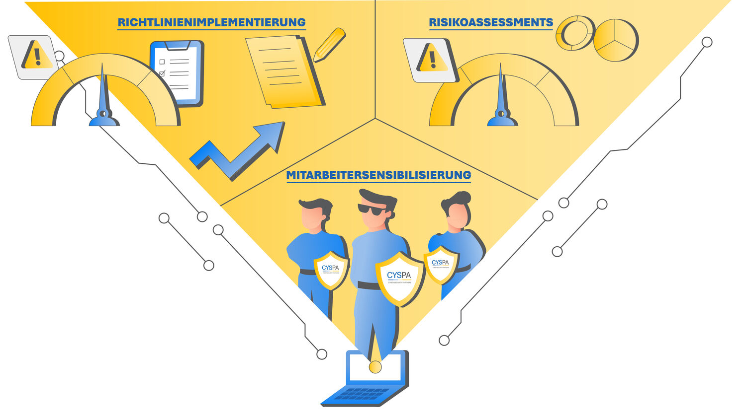
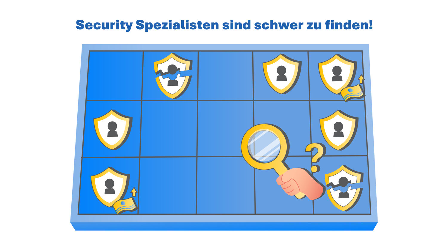
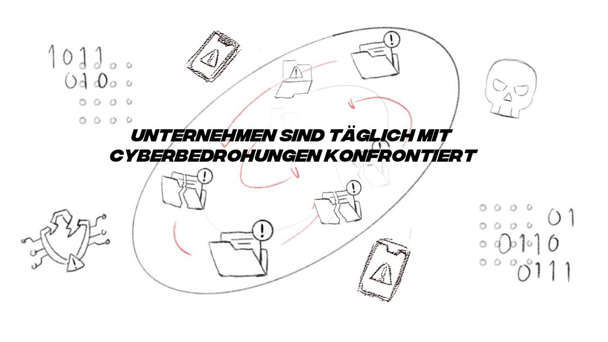
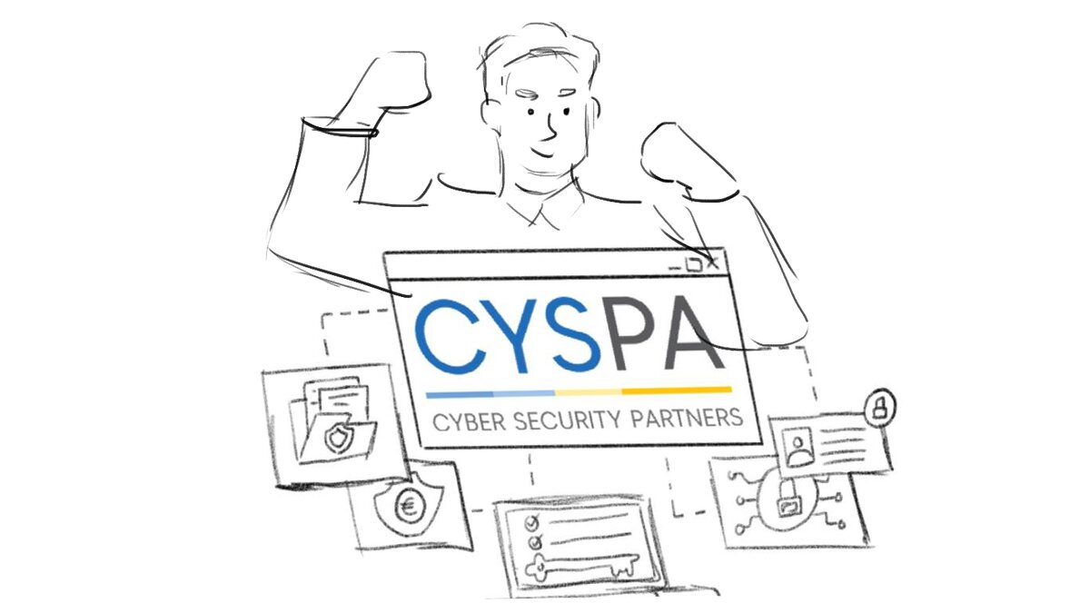
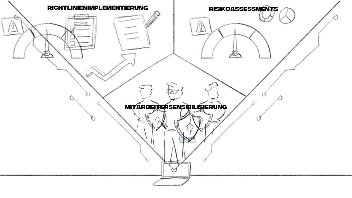
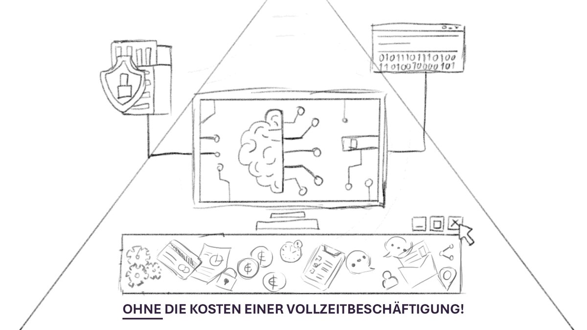
Storyboards first — the frame order is agreed in pencil before anything gets coloured.
02 — Illustration system
Ammersee — flat meets isometric
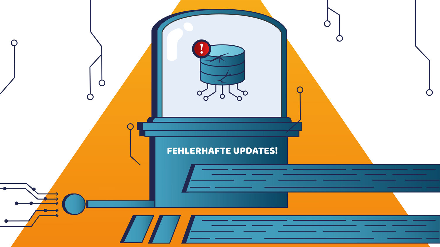
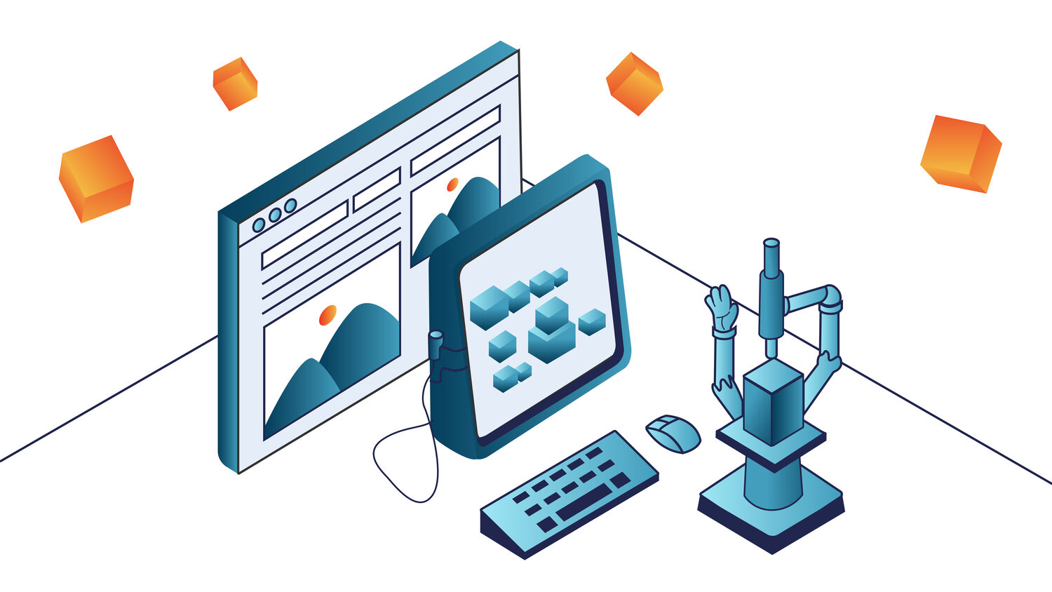
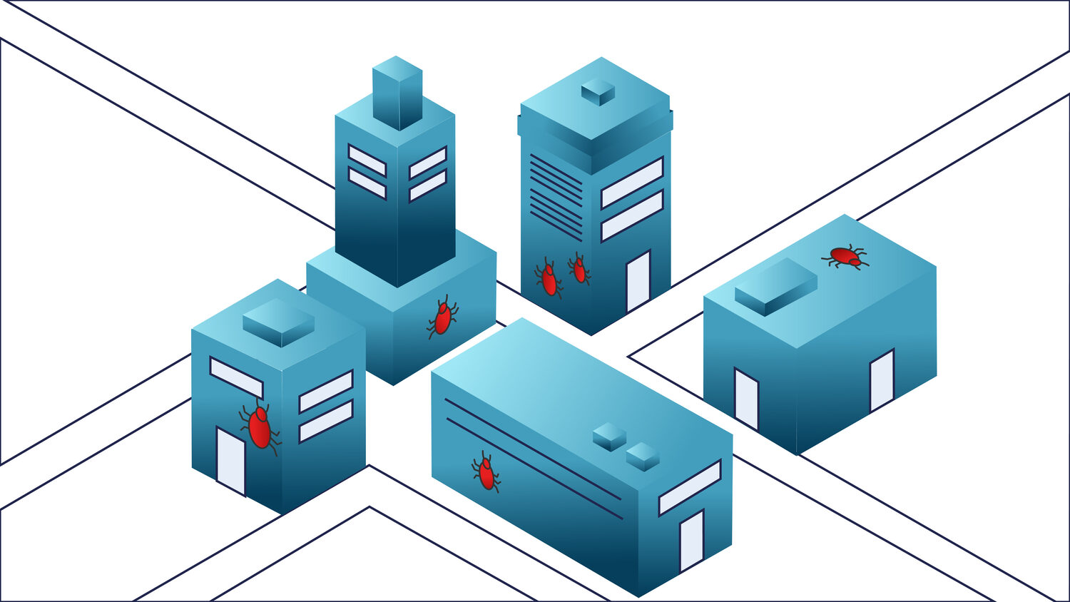
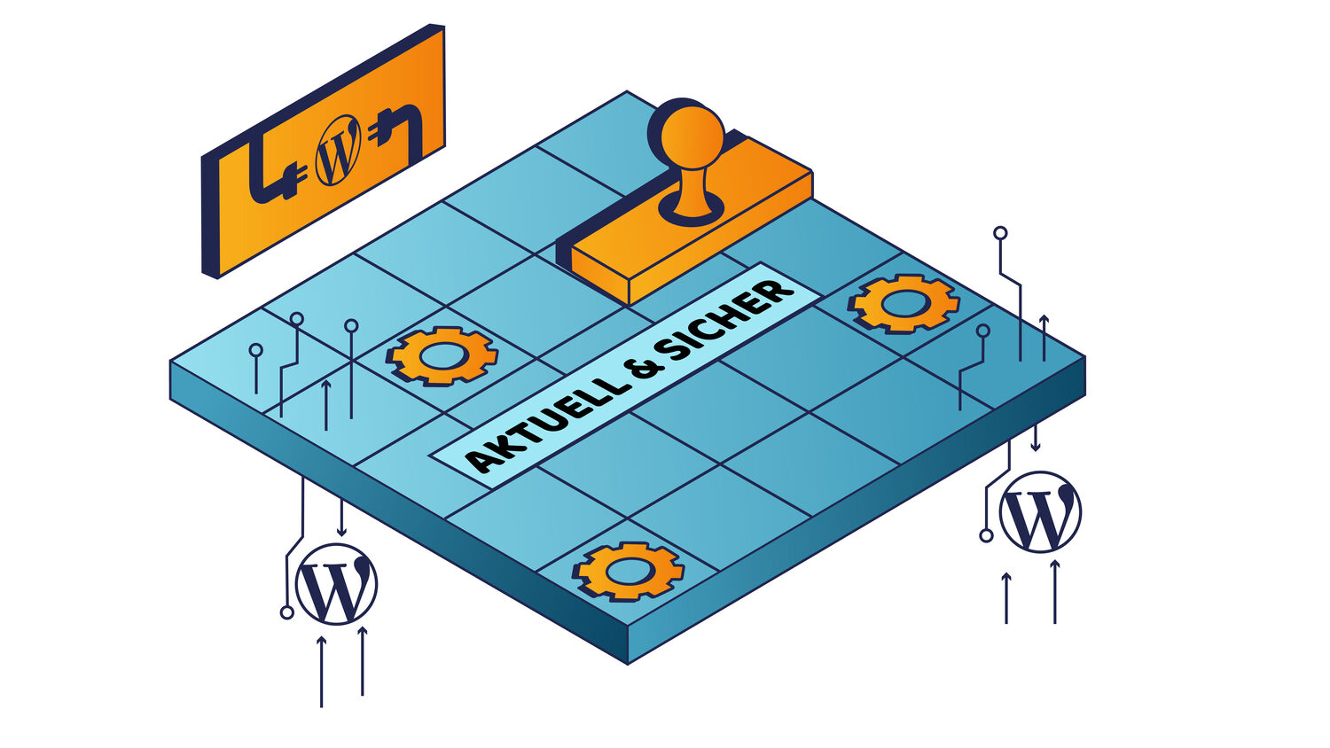
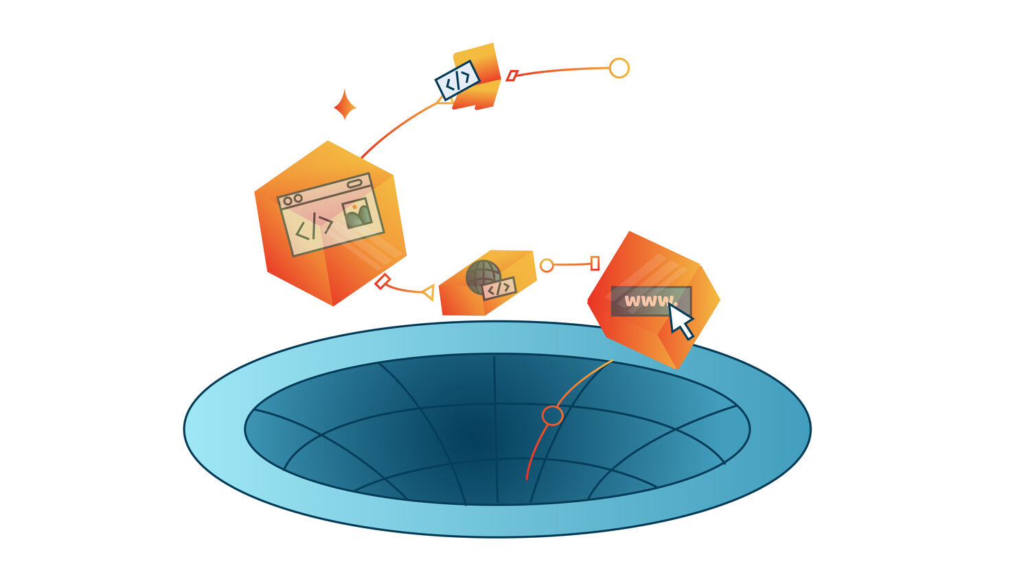
A teal-and-orange set for a German technology services client, mixing flat scenes with isometric constructions. Flat when the subject is a person or a feeling; isometric when it is a system with parts that relate to each other.

03 — Motion
Three films, three registers
Each explainer gets the drawing style its audience expects — the animation follows the brand, not a house style.
PCI — hand-drawn brand tour
A construction-chemicals roadshow, drawn with a deliberately loose hand so a B2B tour feels like an invitation rather than a sales deck.
Balko — character-led B2B
Realistic vector characters carrying a problem-then-solution story in German, with subtitles built into the frame rather than burned on afterwards.
ACTICO — dark fintech
Credit-risk software on a near-black stage, with gradient geometry doing the explaining. The restraint is the brand.