Product · Fintech
4XC
A trading terminal turned into a game people can actually read — duels, leagues and a token economy sitting on top of live markets.
Context
Competition, bolted onto a live market
4XC is a crypto-trading platform built around competition. Instead of a lone terminal, it puts traders into head-to-head duels, team battles and seasonal leagues, with a token economy, a referral programme and a portfolio manager underneath.
I designed the product: the flows, the interface, and the system that keeps the whole thing feeling like one product rather than five stapled together.
The problem
Two audiences pulling in opposite directions
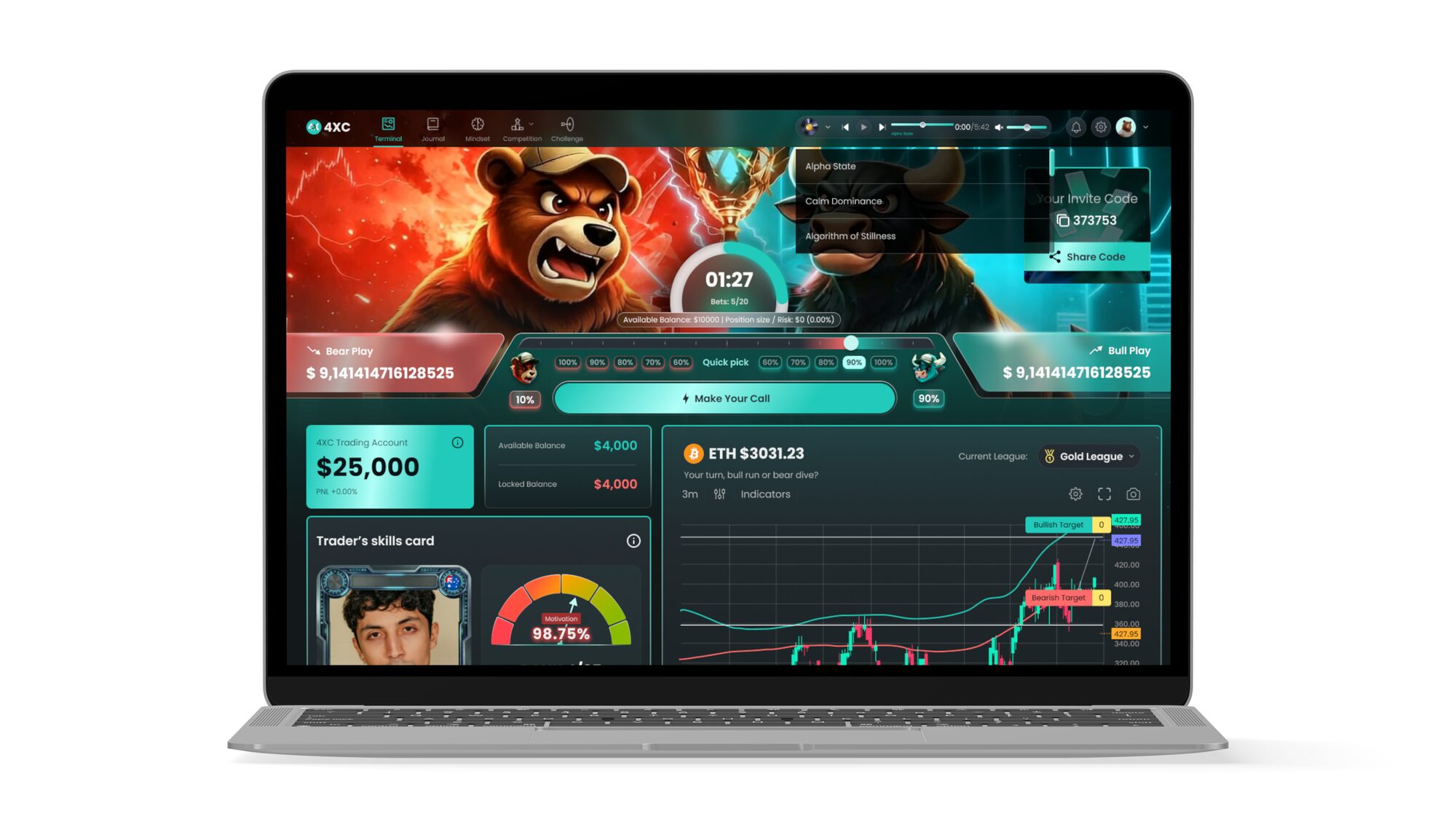
Experienced traders want density — live price, indicators, signal tables, open positions, P&L. Newcomers arrive for the game: the countdown, the bull-versus-bear call, the leaderboard, the prize pool.
Design only for the first group and the game disappears. Bolt the game on top of the terminal and you get a screen that shouts in every direction and is readable in none. The real design problem was hierarchy, not decoration.
Approach
Three rules that made the rest easy
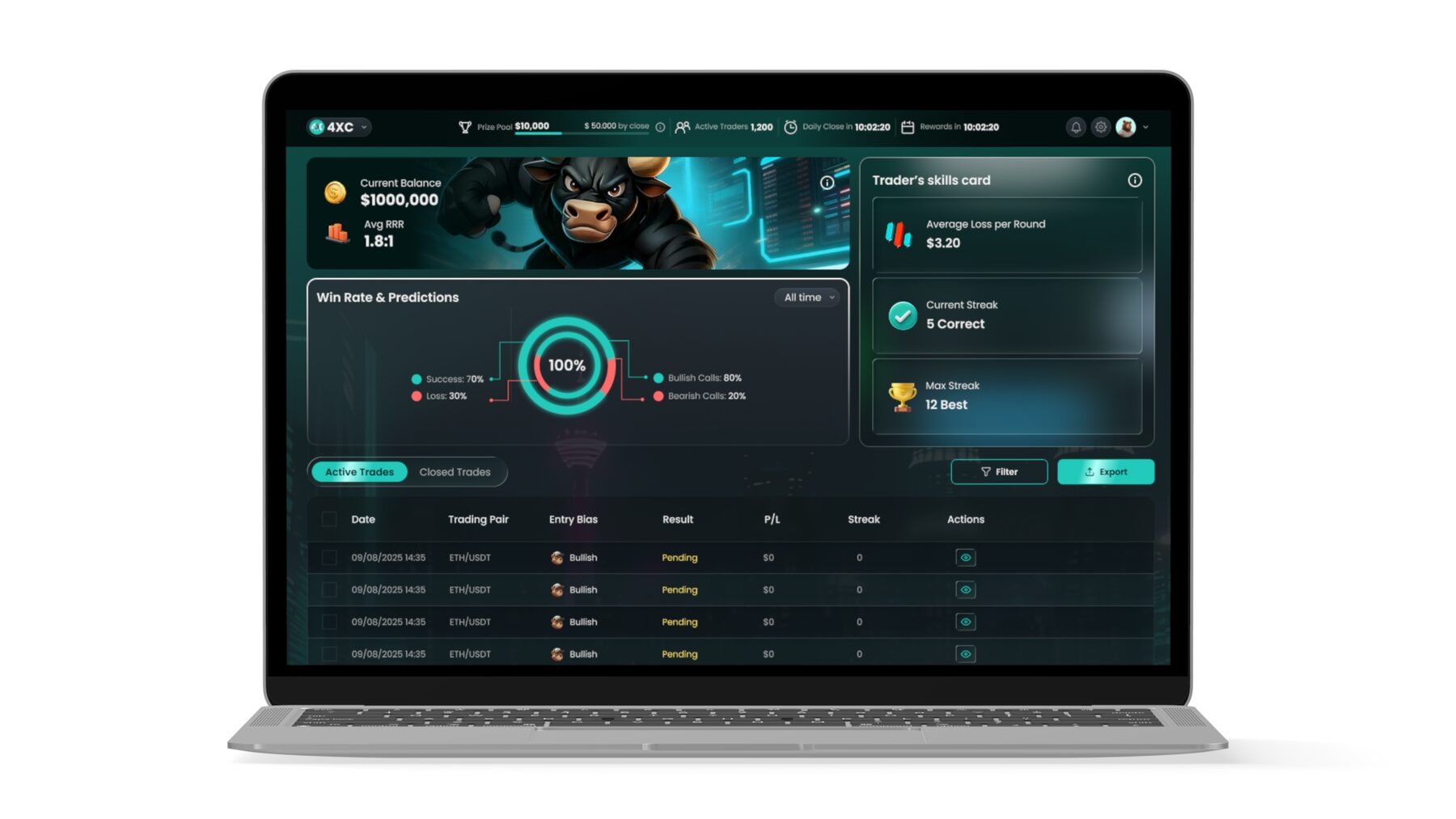
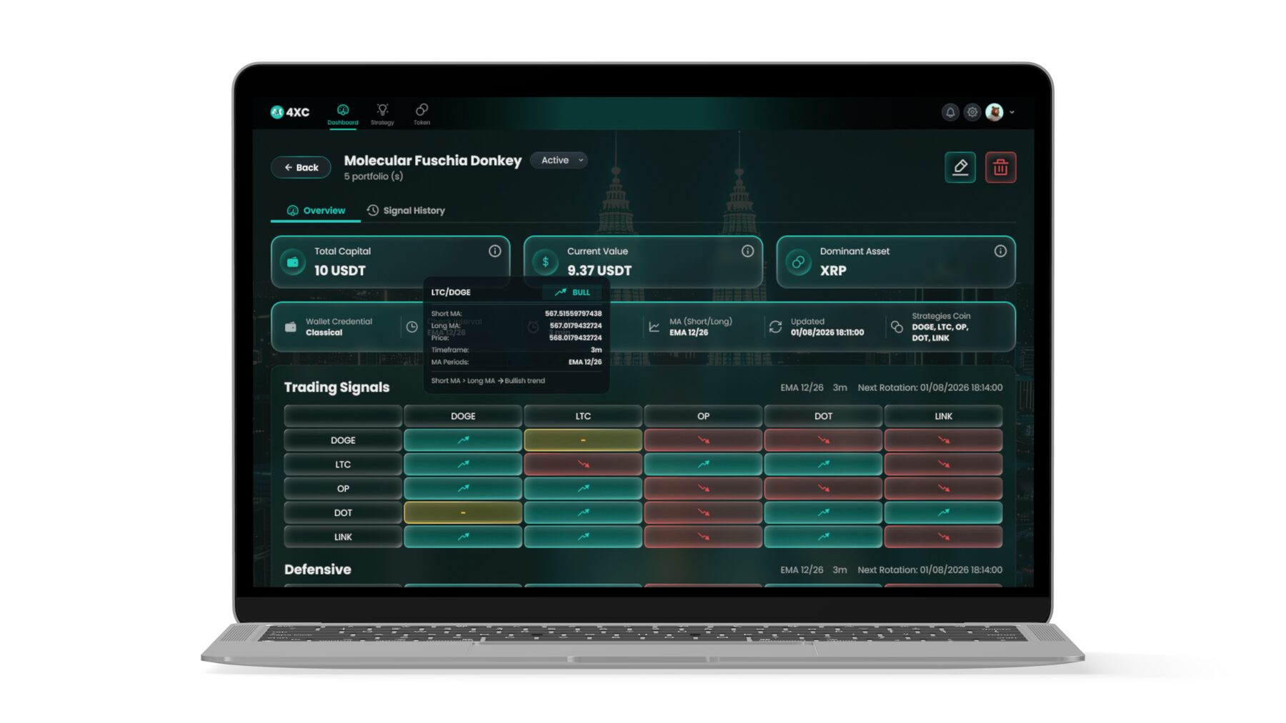
1 · One accent, one meaning. Mint green is the only colour that means yours, positive, go. Red only ever means loss. Everything else is a shade of the dark surface — so a single green figure can be found instantly on a crowded screen.
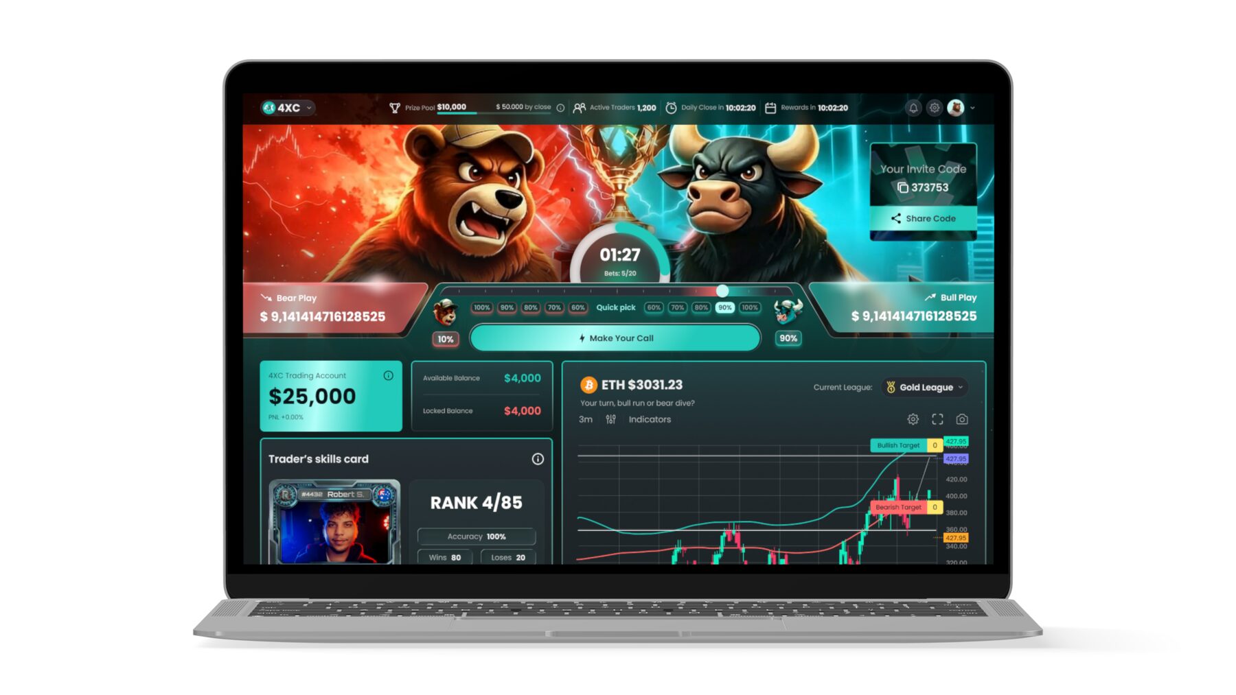
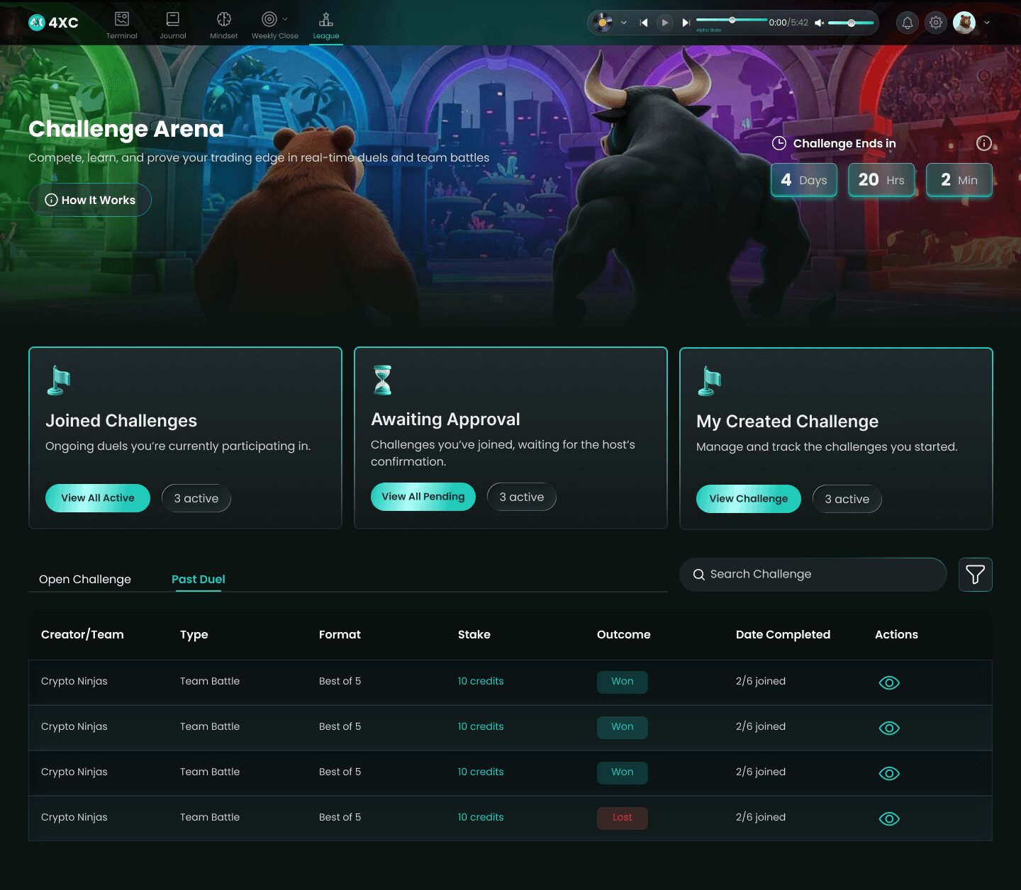
2 · Theatre at the top, numbers below. The gamified moment gets full-bleed artwork and real breathing room. Below it, everything switches to quiet tabular data on a consistent rhythm. The eye knows where it is.
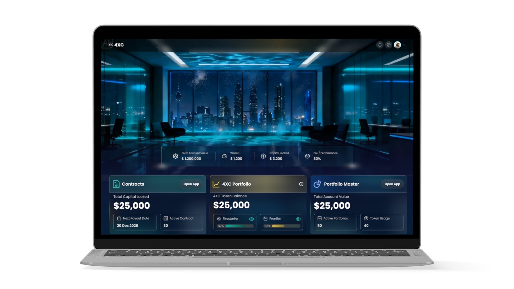
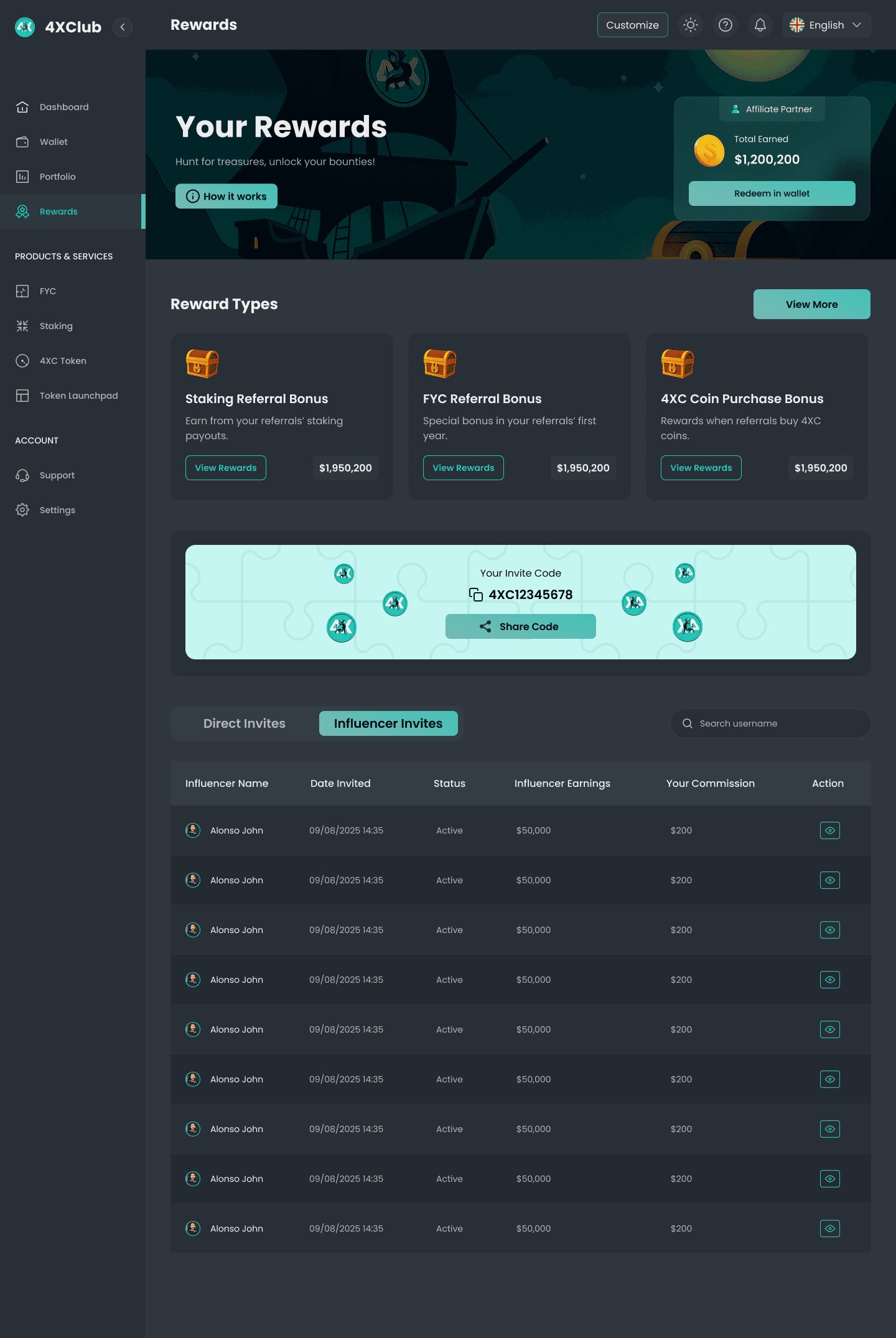
3 · Every module is a card with one job. Balance, win rate, risk stats, signals, invites — each is self-contained with its own header and info affordance, so layouts can be re-ordered per breakpoint without redesigning anything.
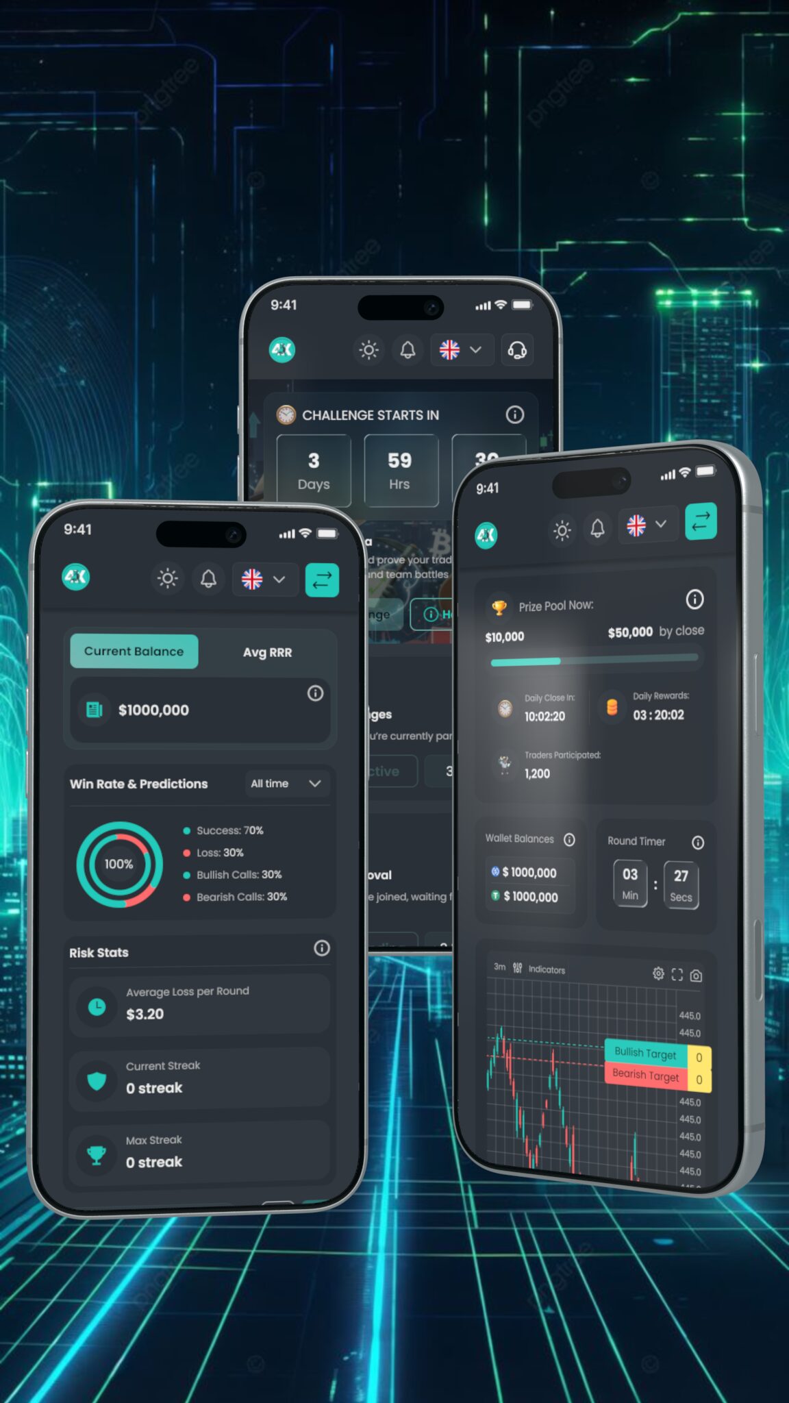
The same system, stacked
Because every module is an independent card with its own header, the phone layout is a re-order rather than a redraw — balance, win rate and risk stats simply become one column instead of three.
The one thing that could not be re-ordered was the arena: the countdown and the bull/bear call need to be above the fold on a 390 px screen, so on mobile they lose the artwork and keep the numbers.
Outcome
What shipped
- A dark design system — surfaces, cards, tables, chips, badges and empty/loading states.
- The web app: dashboard, challenge arena, signals, portfolio, rewards and settings.
- A mobile app reusing the same tokens and card modules.
- Marketing artwork direction for the bull/bear key visuals.
All figures shown are placeholder data from the design files.