Product · Responsive
LifeFrame
A life-organising app rebuilt as a living shell — one set of pieces that works on a phone, inside an article, and as a desktop app.
Context
A life organised as photo cards
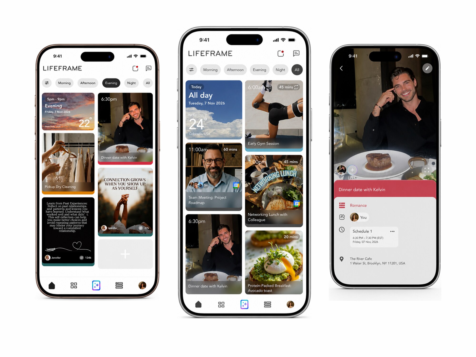
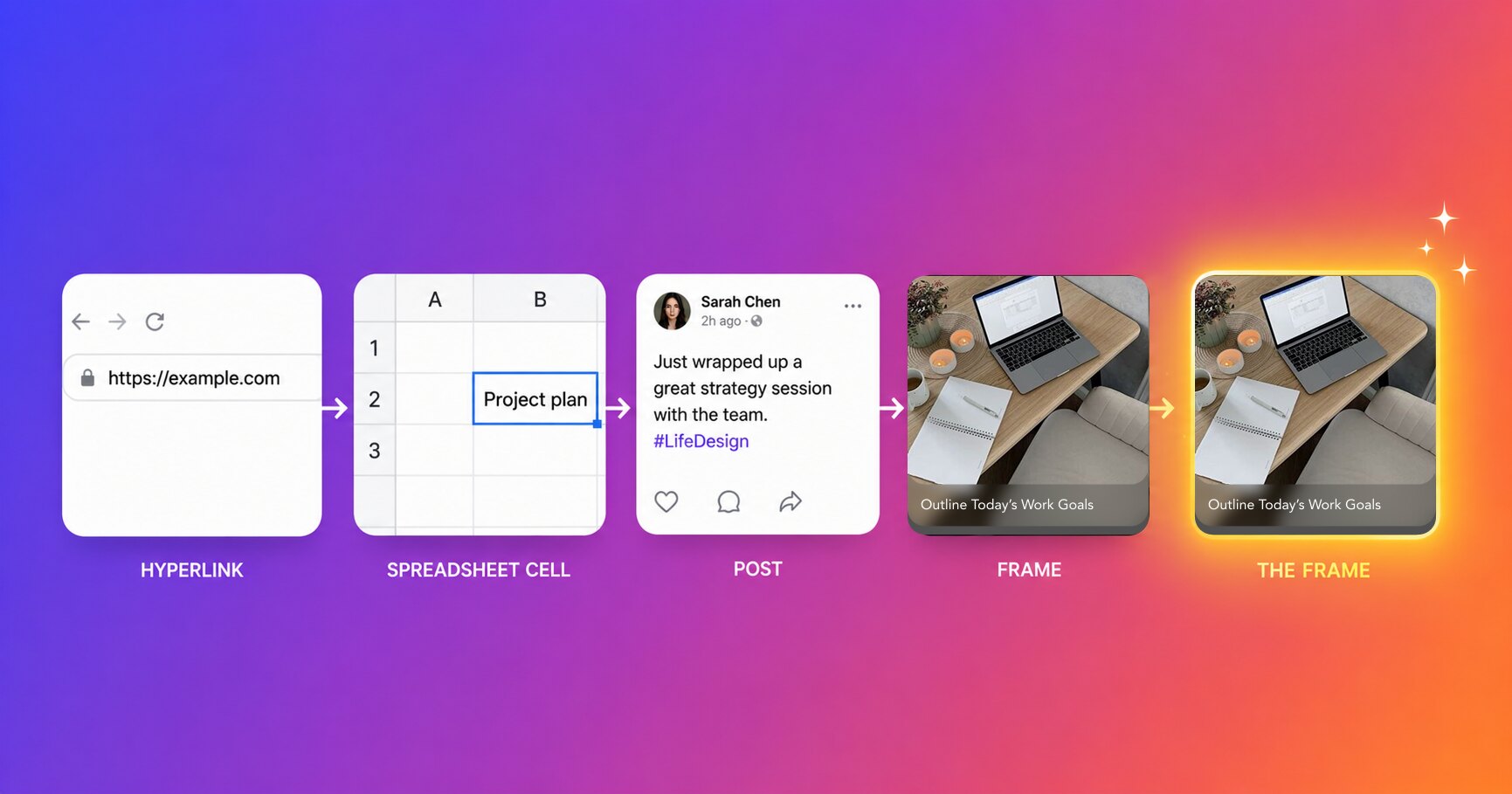
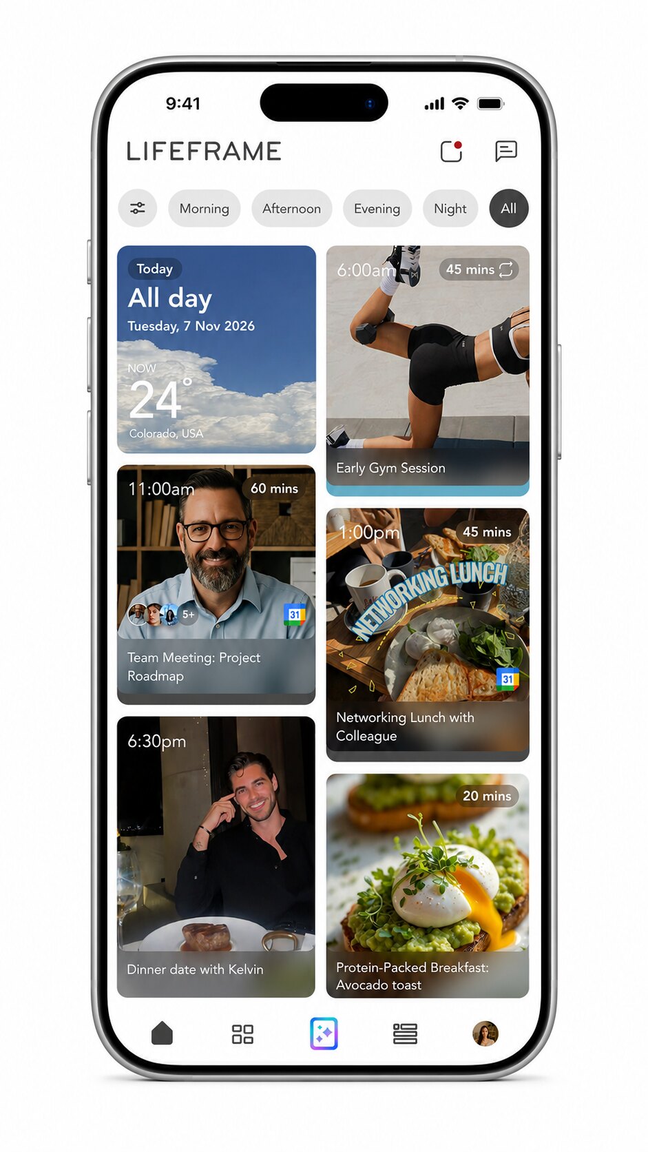
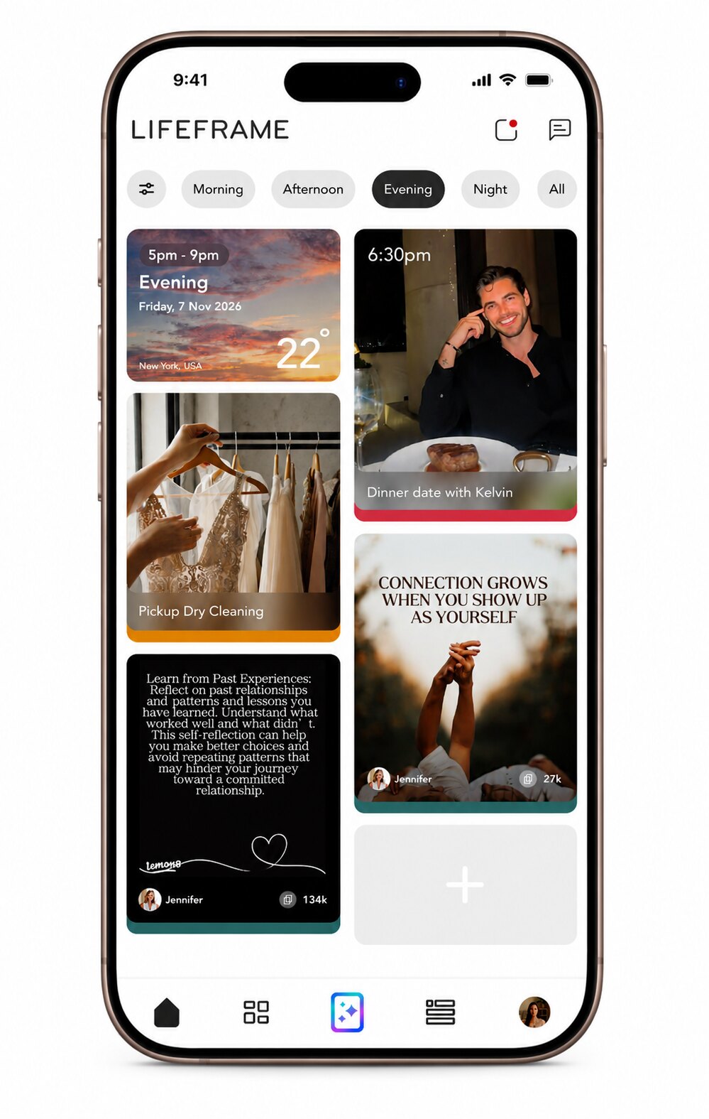
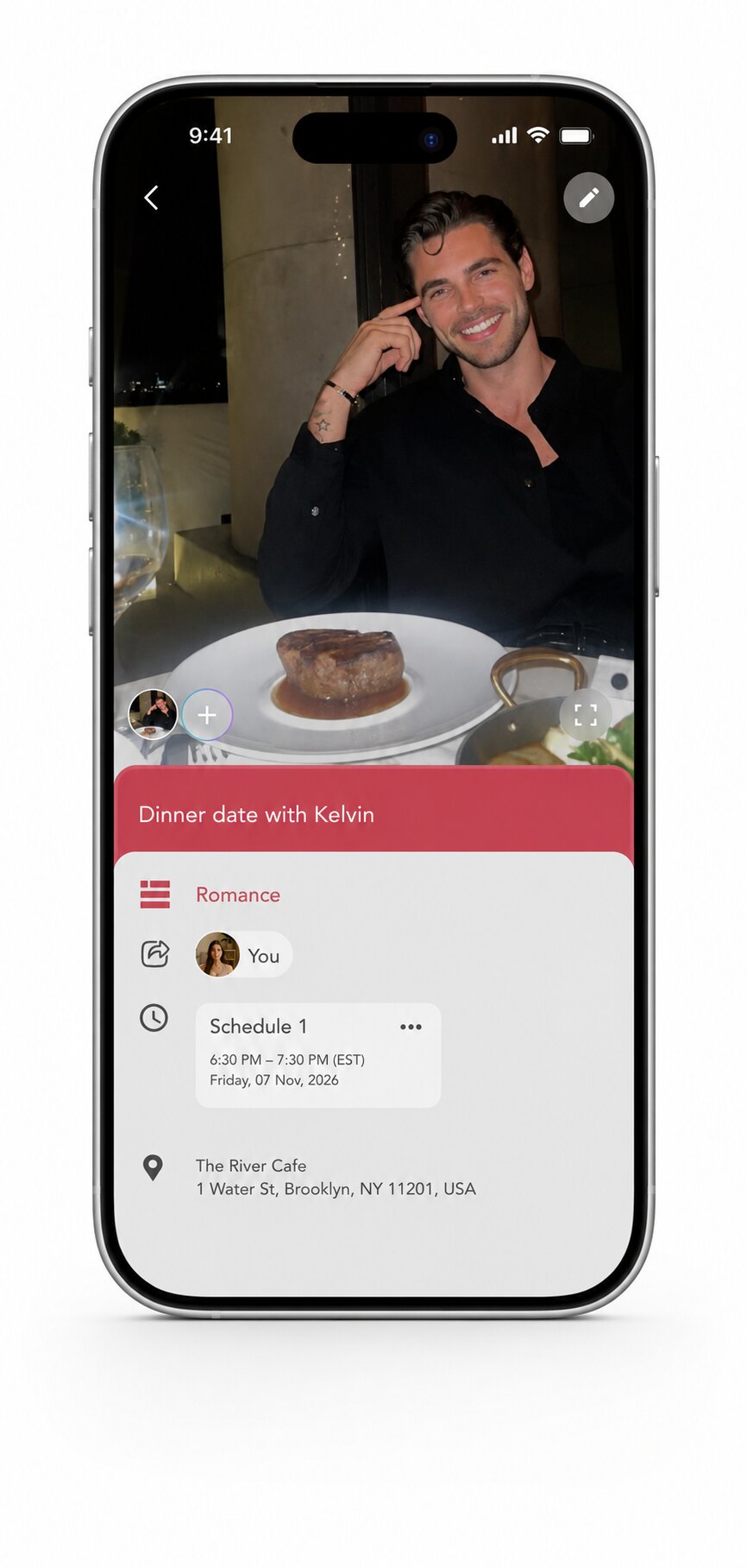
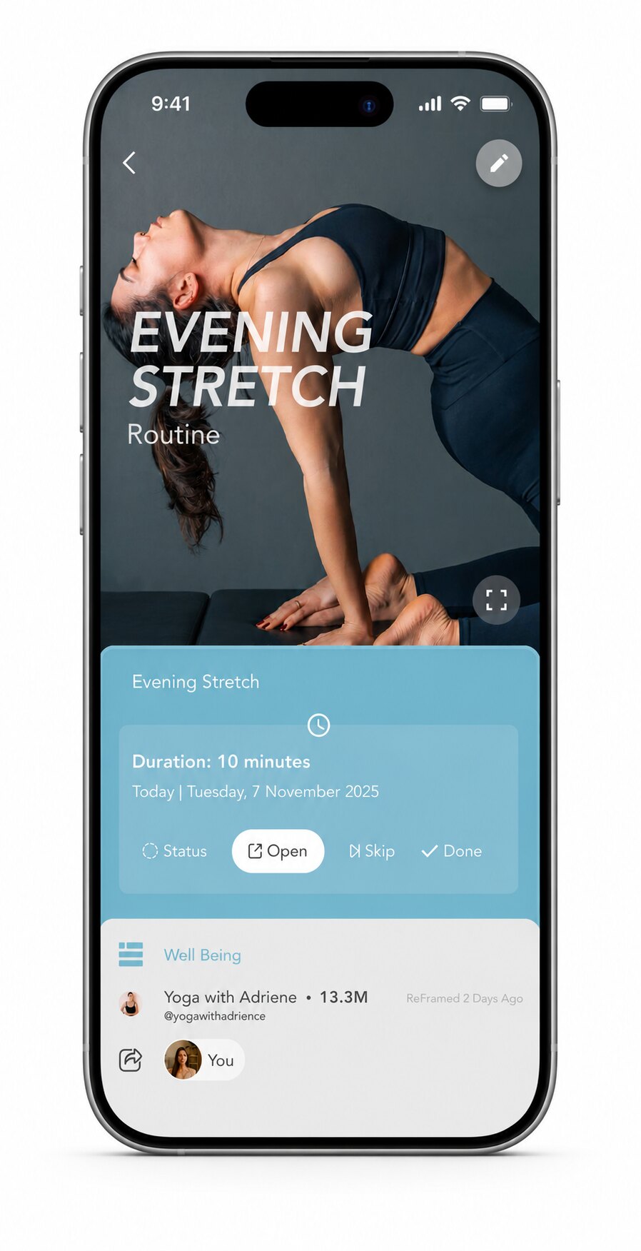
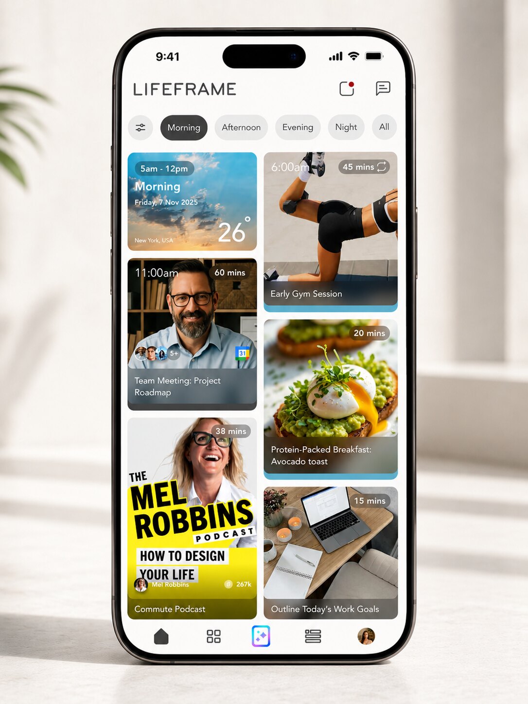
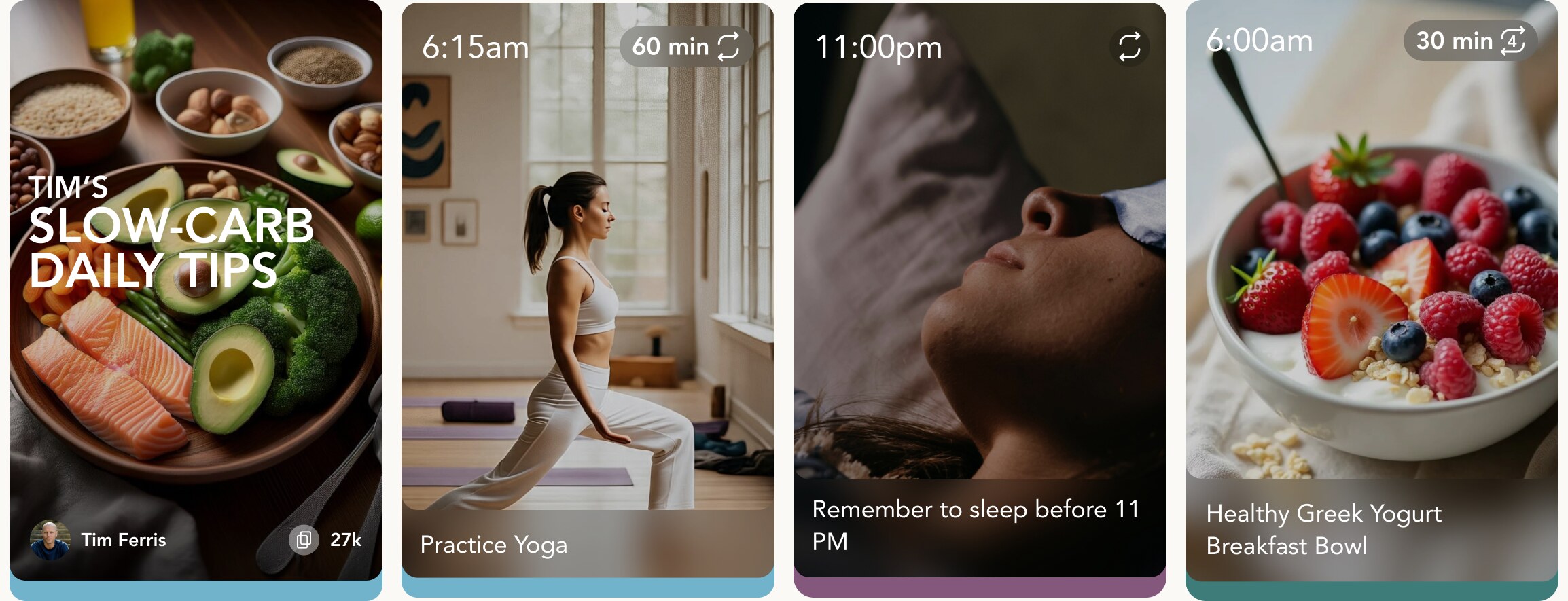
LifeFrame is built around one object: the Frame. A moment, an event or a task — “Morning run”, “Dinner with Sam”, “Finish tax return” — shown as a photo card. A Frame carries a schedule, media, participants, a Life Area (Work, Romance, Well Being) and notes.
People organise their lives visually, and can make Frames public so others can reframe them — take someone else’s routine as the starting point for their own.
See it move
The reason this exists instead of screenshots
Fifteen seconds of the real shell running in a browser — day view, opening a frame, the social feed, life areas, and the create sheet sliding up. No video editing: this is the HTML responding to taps.
The problem
Screenshots of an app are not an app
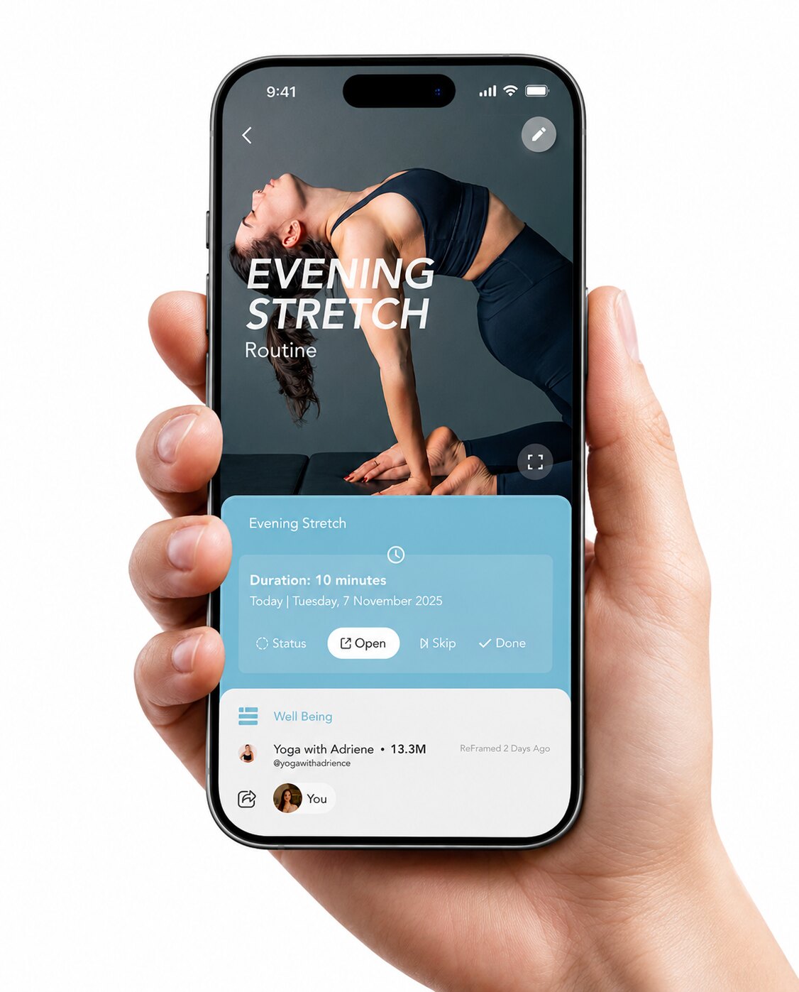
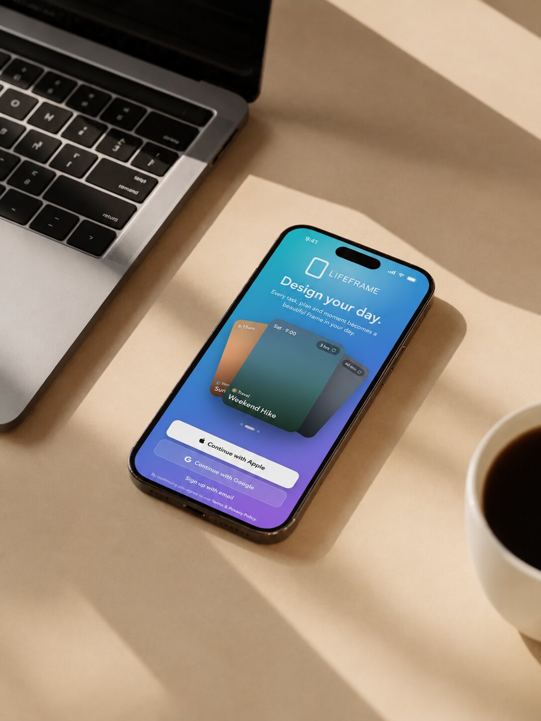
The product existed as a mobile app. Everywhere else it appeared — the marketing site, the story pages, the article series explaining how Frames work — it was flat screenshot exports pasted inside phone bezels. Faded, static, unclickable.
The brief was to rebuild the app’s shell in plain HTML, CSS and JavaScript: the screens, the components, the layout and the motion, with mock data and no backend. Real markup means vector text, working animation, and a frame card that opens when someone reading an article taps it.
Then the same code had to widen into a desktop app.
Approach
Four constraints that decided everything
1 · Pieces before screens. Before a single screen existed: the frame card in each of its states, the filter pill, the header, the life-area chip, the skeleton block. Each piece takes its own data, renders in isolation and carries its own styles without leaking. That is what lets one card sit alone on a white article page — and it is why desktop later becomes a handful of rules instead of nine redraws.
2 · Container queries, not media queries. The phone layout has to render as a phone inside a phone-sized frame on a wide desktop page. Media queries read the browser window and would put the desktop layout inside the bezel. Container queries read the container, so the same markup is honest at every scale.
3 · Layout by relationship, never coordinates. Flex and grid only. “These cards sit in a row and wrap when they run out of room” rearranges itself as the window widens; “this card sits 24px from the top” is nailed to the floor. Breakpoints are layout events, not devices — found by dragging the window, not declared in advance.
4 · Motion is a deliverable, not a finish. Durations and easing curves came from the app’s own animation spec rather than being eyeballed. The app’s spring animations were sampled and re-encoded as CSS linear() easing — approximating a spring with ease-out is the single most reliable way to make a rebuild feel subtly, unplaceably wrong.

Widening it
Desktop as a rule, not a redraw
Because the layout was built as relationships, desktop mostly came down to two structural events: bottom tabs become a persistent left sidebar, and the card grid widens past two columns. Frame detail opens as a side panel instead of a full takeover.
The day view earns the most from the extra room — day-parts become parallel columns instead of a single scroll, so a whole day is legible at a glance.
What I designed
Flows added on top of the shell
- Chat prototype. Tap the input, the keyboard rises, a reply types itself and sends with a timestamp — the whole exchange as one continuous piece of motion.
- Shared-frame flow. A shared frame card inside a chat → View → the frame detail → Join or Decline.
- Join approval. Join becomes a Requested pill, then Joined, and the frame drops into the Day view with a highlight and a toast — so the state change is felt, not just recorded.
- Life-Area assignment for a joined frame, the four frame-state structure, and the logic that decides when something is a ReFrame versus a Join.
- Full-screen photo viewer — cover selection, thumbnail reordering, crop and shuffle, reachable from viewing, editing and creating a frame.
- Social feed card footer — author, reframe count, one row, no hover states, because phones do not have hover.
Beyond the app
A feed that had to match the product
The same visual language had to survive outside the app. I built a post system for the social feed: layout templates, a grid composed twelve tiles at a time, and quote cards that borrow the frame card’s proportions so a post and a Frame look related.

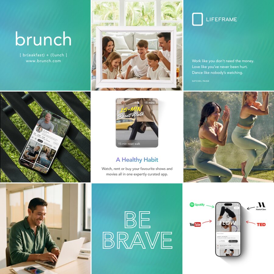

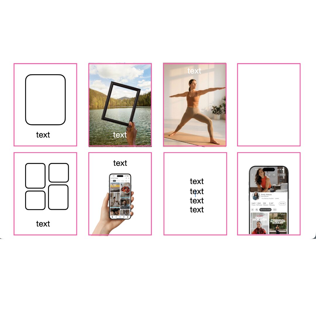
Eight layout slots, each defining where image, device mockup and text may sit — so a month of posts can be filled in without redesigning anything.
The device mockups reuse the shell screens directly, which means a UI change propagates to the marketing images instead of leaving them stale.
What I took from it
Add around the core; don't restyle it
Working in short review rounds against a product owner who reviews by eye taught me where the line sits. New surfaces, new flows, new card details — welcome. Moving metadata onto a hero image or reworking a detail screen that already works — not, however tempting.
The useful discipline was separating the two in my own head before showing anything: here is the thing you asked for, and here, separately, is a suggestion you can ignore.