Logo · Brand concept
GAIUS
Coffee
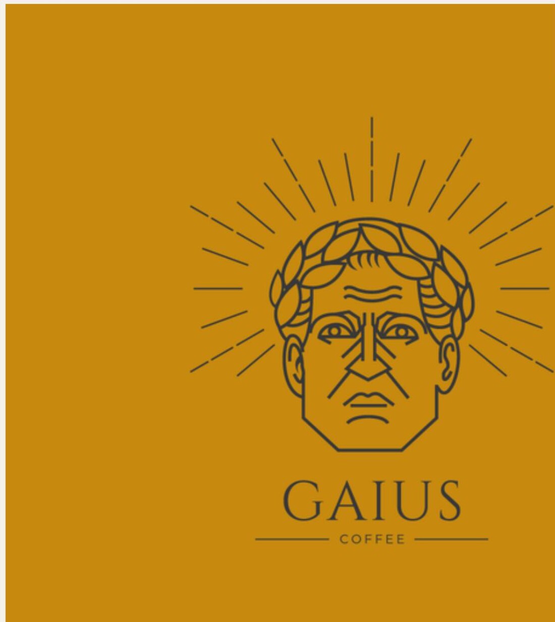
A Roman emperor drawn in a single weight of line, for a coffee brand with a straight face.
The idea
Borrow the authority, drop the pomp
Gaius is a Roman name. The brand wanted the weight that comes with it — permanence, ritual, something older than the shop — without tipping into fancy-dress classicism.
So the mark is a laurel-crowned emperor, but drawn the way a modern line illustration is drawn: flat, even-weight, no shading, no engraving texture. The radiating strokes behind the head do the work that a sunburst does on an old coffee label, at a fraction of the ink.
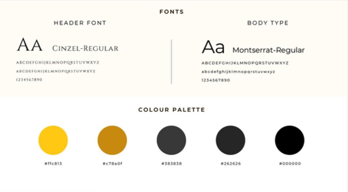
Cinzel carries the headers — a Roman capital face, which lets the typography say “classical” so the logo does not have to say it twice.
Montserrat handles everything else: menus, labels, small print. It stays out of the way.
The palette is one gold doing two jobs — a bright #ffc813 for surfaces, a deeper #c78a0f for the mark itself — over three greys down to black. Coffee brown appears nowhere, on purpose.
The mark holds together down to a stamp: the laurel reads as texture, the face as a silhouette, and the radiating lines as a halo. Below that size the wordmark goes on alone — GAIUS letterspaced wide, COFFEE beneath it between two rules.