Product · App
8 Pops
Custom-flavour ice cream, ordered and voted on by the people who eat it.
Context
An ice cream brand that takes requests
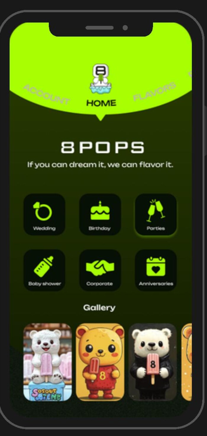
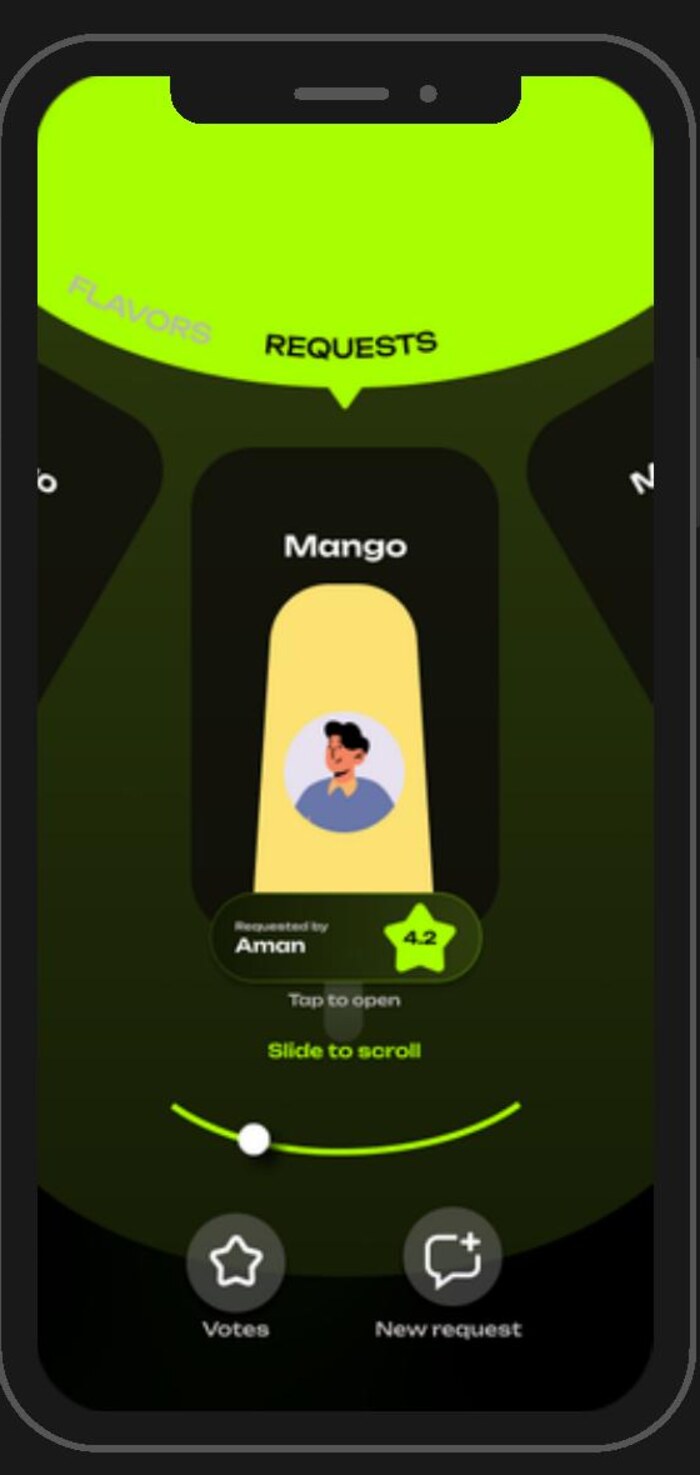
8 Pops makes custom-flavour popsicles for weddings, birthdays, corporate events and baby showers. The interesting part of the business is not the catalogue — it is that customers request flavours, and other customers vote on them.
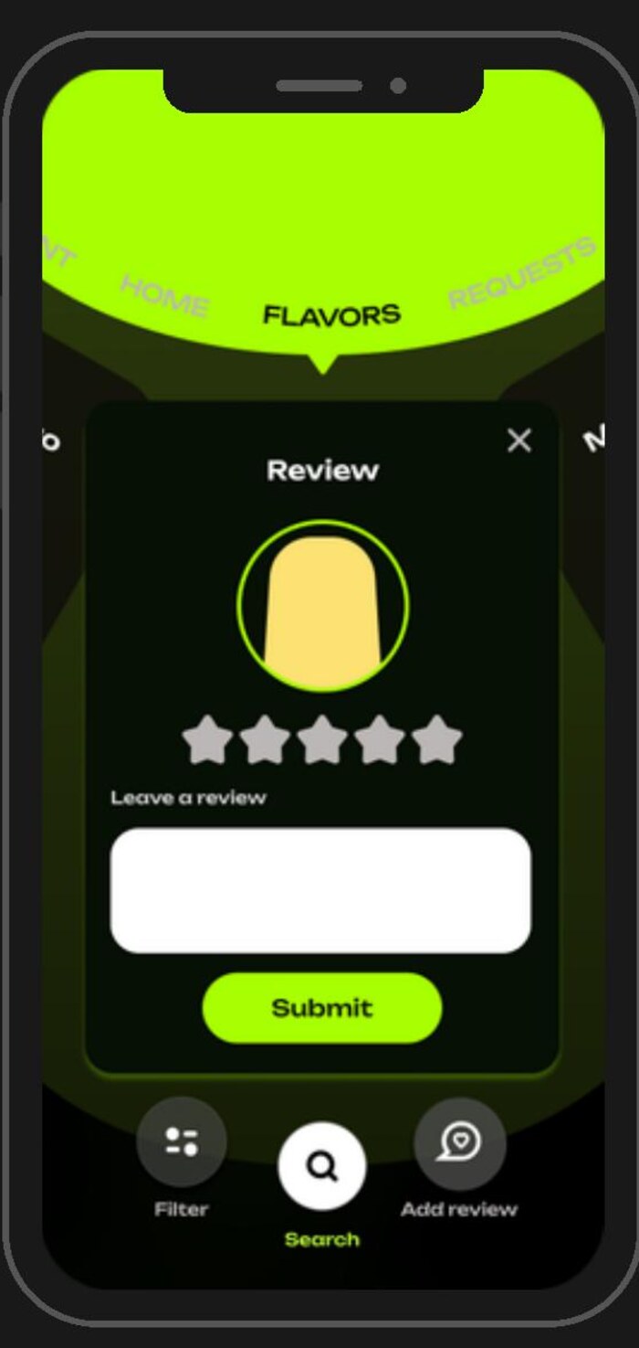
So the app had to do three things at once: sell the existing range, take a request, and make the voting feel like a game worth coming back to.
Approach
Dark room, lit product
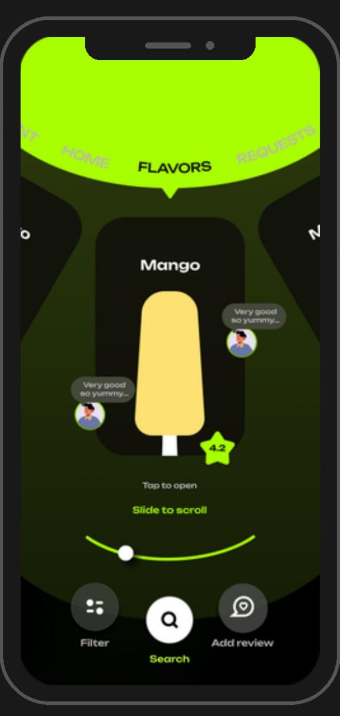
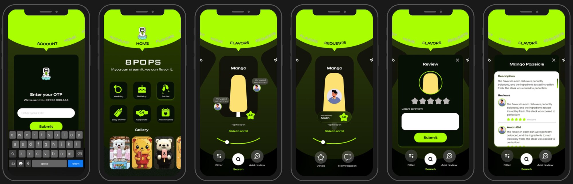
The interface is a display case. Near-black surfaces with a single acid green push the popsicles forward — they are the only saturated, warm objects on screen. Nothing else competes for attention.
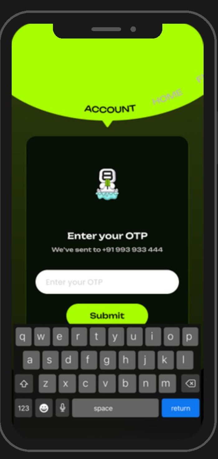
The header is a scroll of occasions. Rather than a tab bar of nouns, the top curve carries ACCOUNT / HOME / FLAVORS / REQUESTS on an arc that rotates as you move — the navigation itself behaves like a dial on a machine.
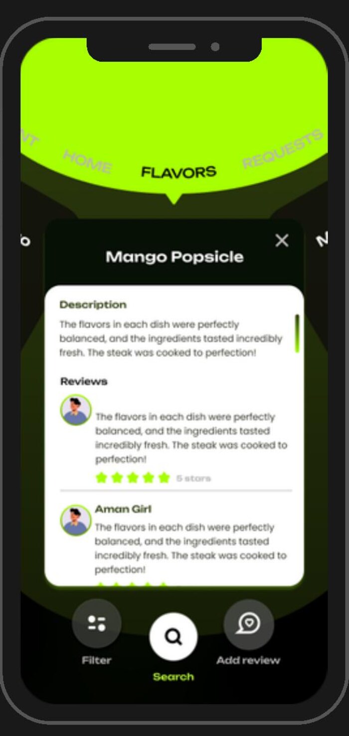
Social proof sits on the product. Review bubbles and the requester's avatar float directly beside the popsicle rather than in a separate reviews tab, so the flavour and the opinion of it are one object.